
-
Feral Kitchen + Lounge transforms a former downtown nightclub into a cinematic, sensory-driven escape built for slowness, curiosity, and genuine connection. The brand lives in duality: wild yet refined, primal yet intentional — a gathering place for the beautifully untamed.
FERAL KITCHEN + LOUNGE
Brand identity and environmental direction for a downtown San Luis Obispo hospitality concept — transforming a troubled former nightlife space into a cinematic, mood-driven lounge built for slowness, curiosity, and the beautifully untamed.
ROLE
Creative Direction, Brand Identity, Environmental Design, INTERIOR DESIGN, Menu Design, Signage, Printed Collateral, Merchandise, Photo Art Direction, COPYWRITING
INDUSTRY
HOSPITALITY
OVERVIEW
Feral didn't start as FERAL. The space had previously operated as Mother's Tavern, a venue carrying enough reputational damage that a simple refresh felt insufficient. The concept evolved through multiple pivots — from Mother's to Bishops, an American style eatery drawing from local flora and fauna — before landing on the right idea: a name sparked by a joke on a merchandise sheet, a raccoon labeled "be feral."
Once that direction surfaced, I led the build of a complete brand world from the ground up.
THE CHALLENGE
The project demanded more than a new logo or surface-level redesign. The new concept needed to distance itself from a former identity with negative public perception, navigate multiple pivots during development, and still feel cohesive, premium, and fully realized while staying under budget.
Every design decision had to work harder—shaping not just the visual identity, but the emotional atmosphere of the entire space.
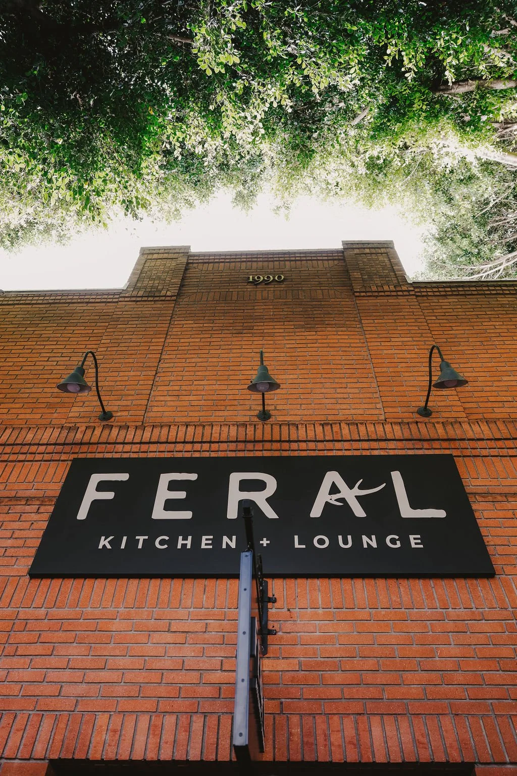
IDENTITY SYSTEM
The identity needed to feel untamed without losing restraint. The wordmark balances clean structure with subtle irregularity — organic curves with just enough raw edge to feel handmade. The palette builds around deep blacks, forest greens, warm ember tones, and bone neutrals: nocturnal, earthy, lived-in. Everything follows the same tension — expressive enough to feel memorable, restrained enough to live across every touchpoint.
TYPOGRAPHY
BRONN RUST, MONTSERRAT
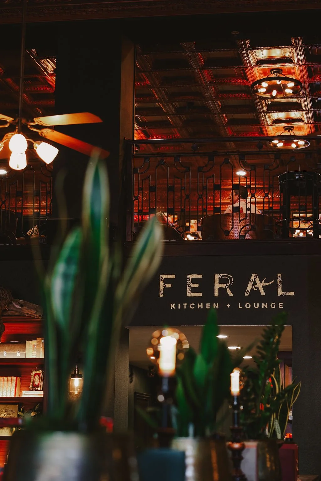
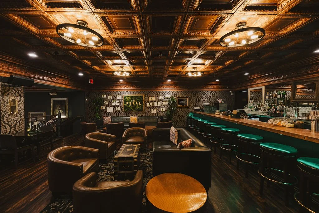
ENVIRONMENTAL DESIGN
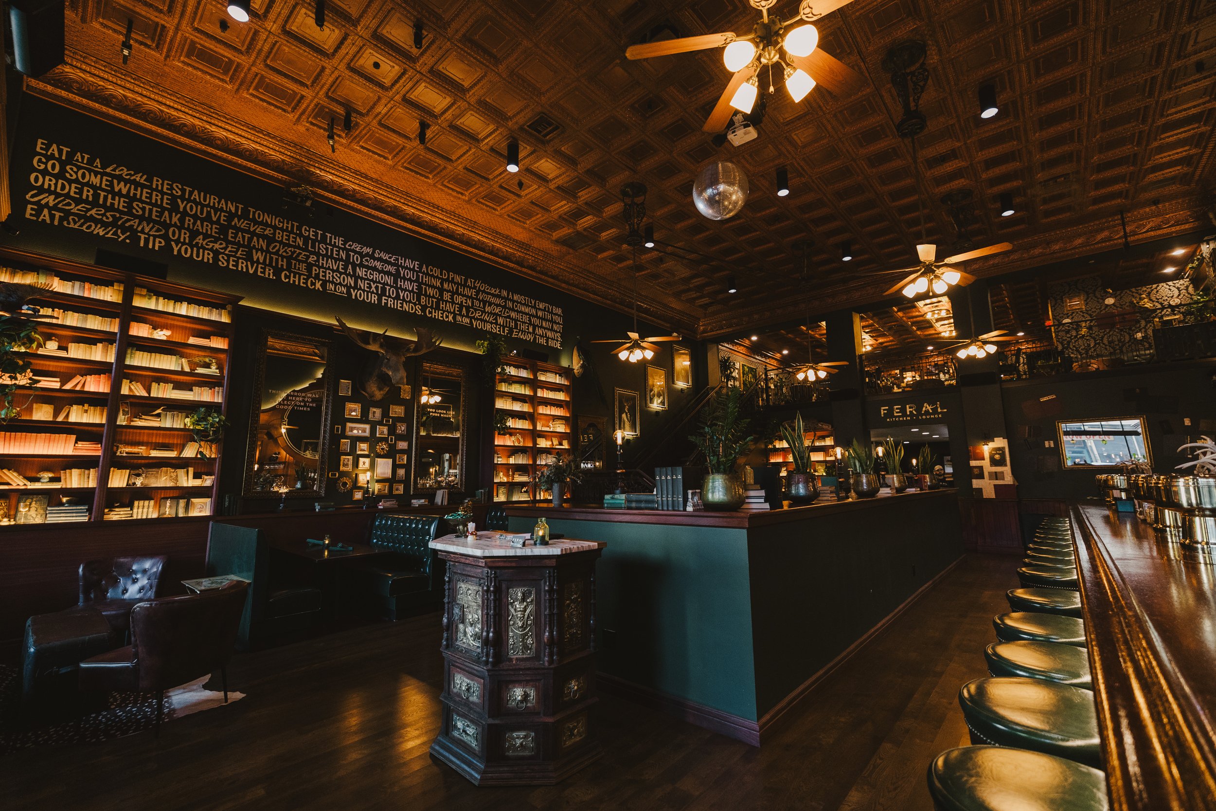
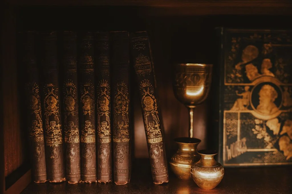
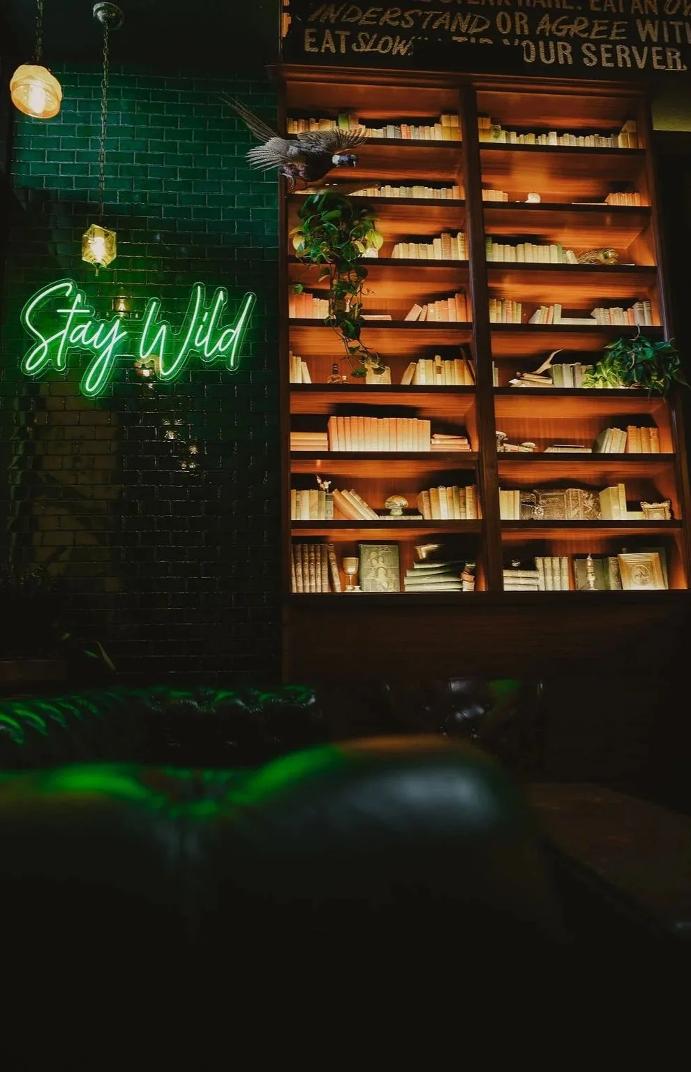
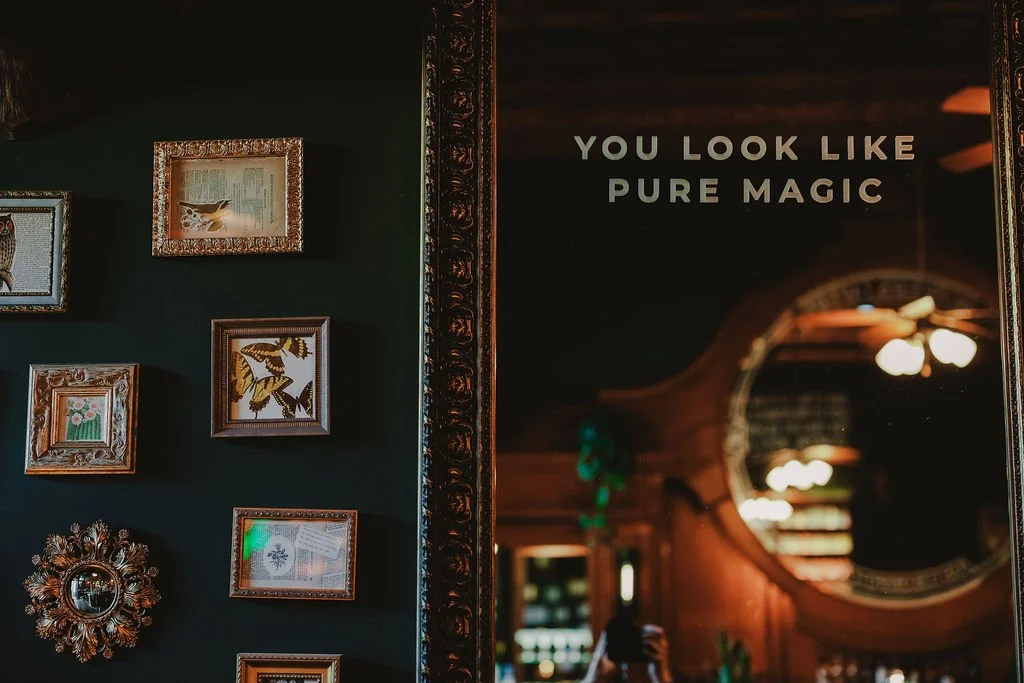
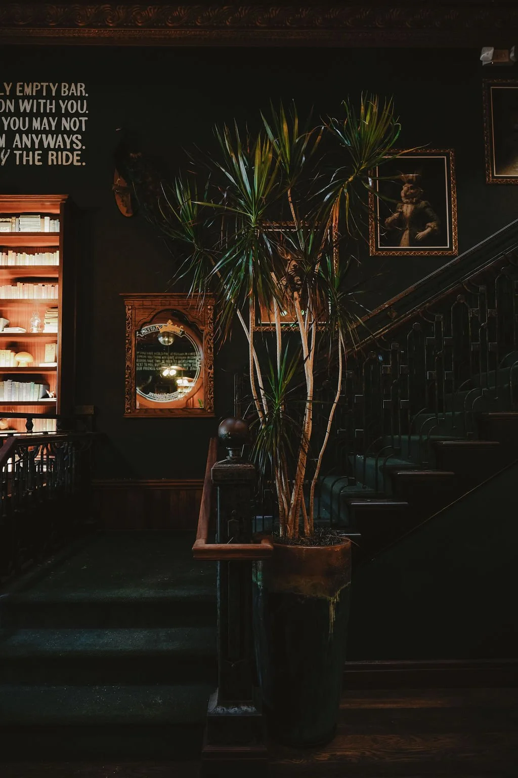
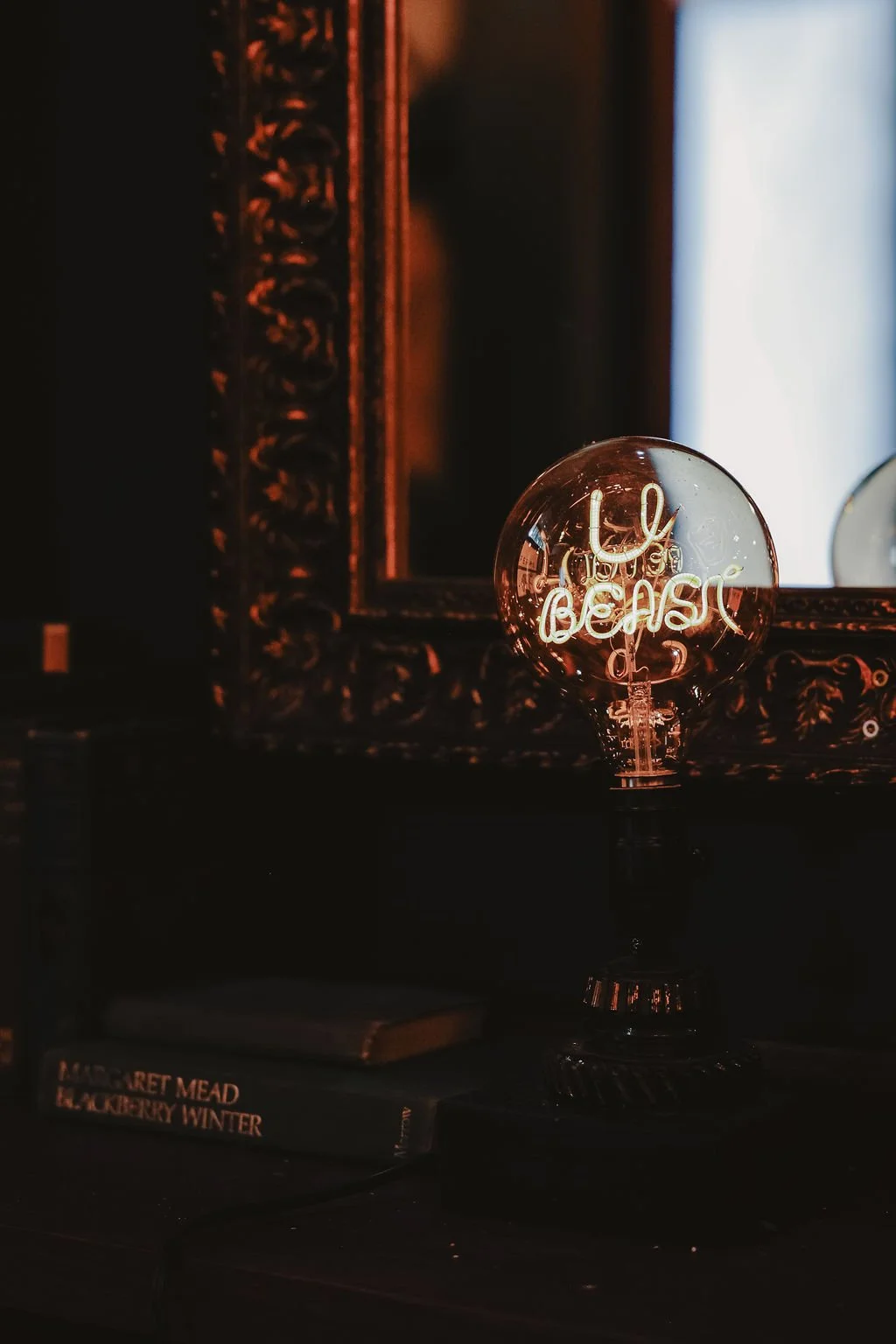
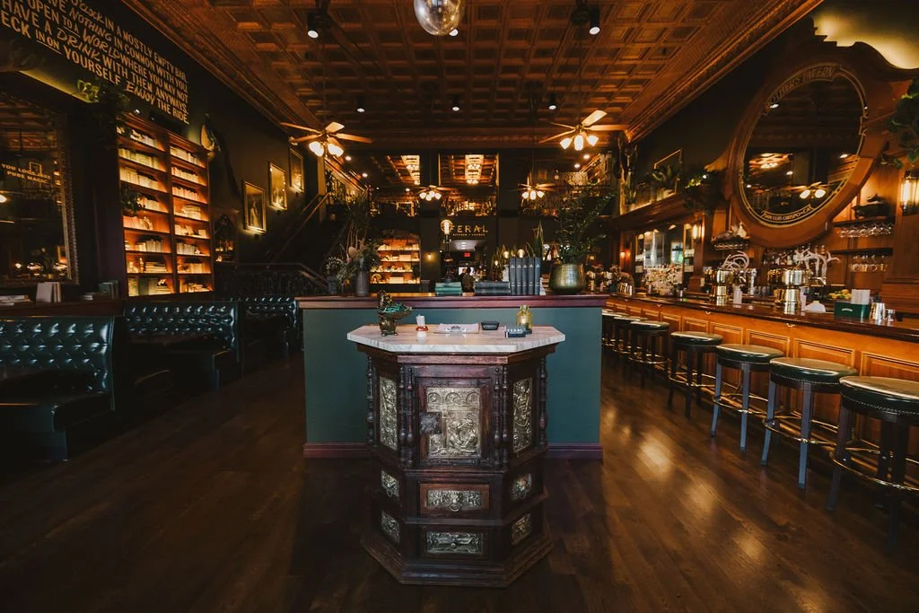
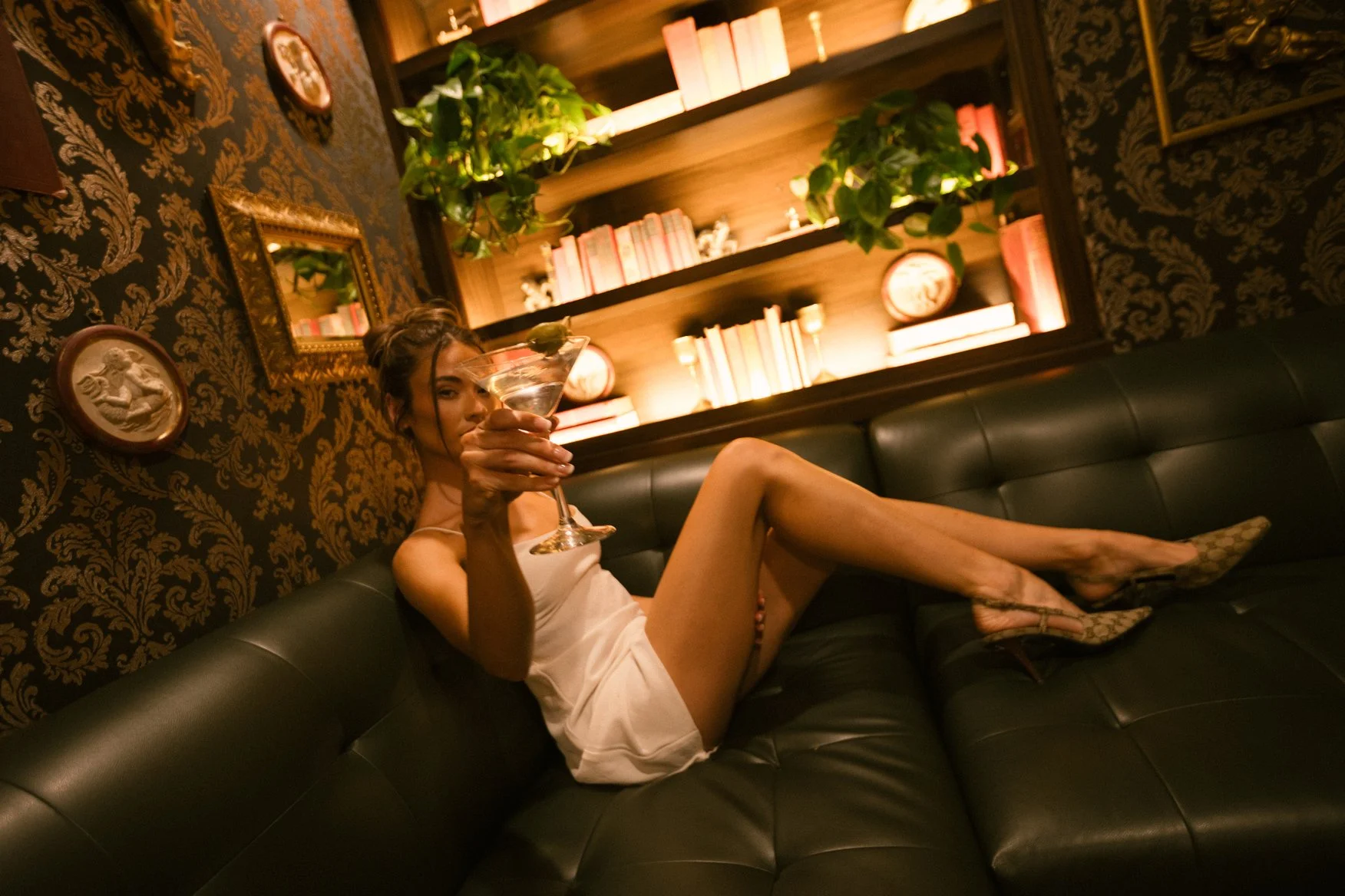
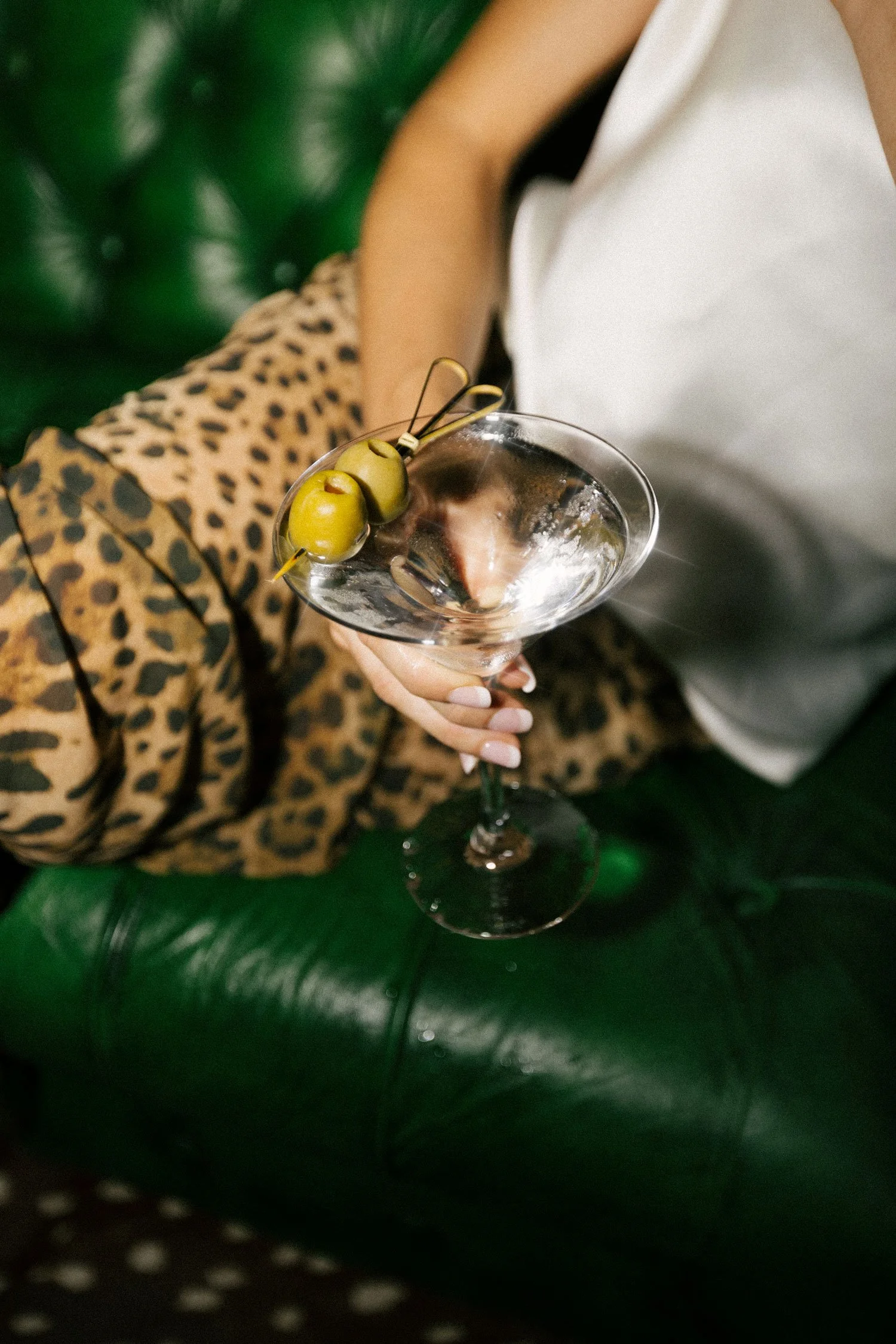
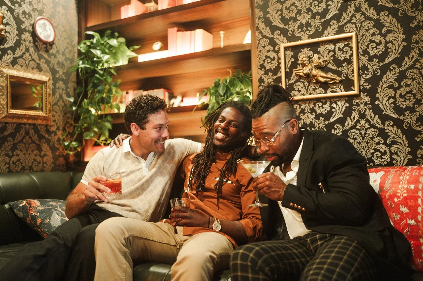
Beyond the identity itself, I helped shape the physical world of the space through sourced decor, layered styling, and mood-led design decisions. Nearly everything in the environment had to be found, selected, and composed with intention. Because the project needed to stay under budget, every object and material choice had to contribute more — adding warmth, texture, depth, and cohesion without relying on excess.
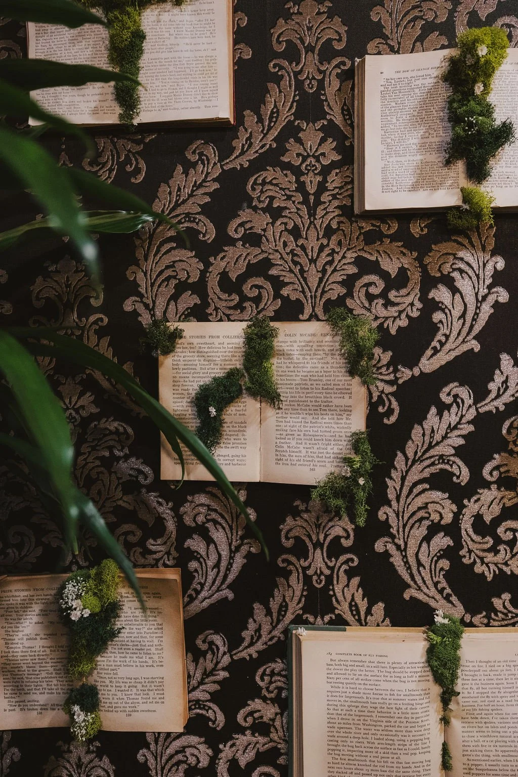
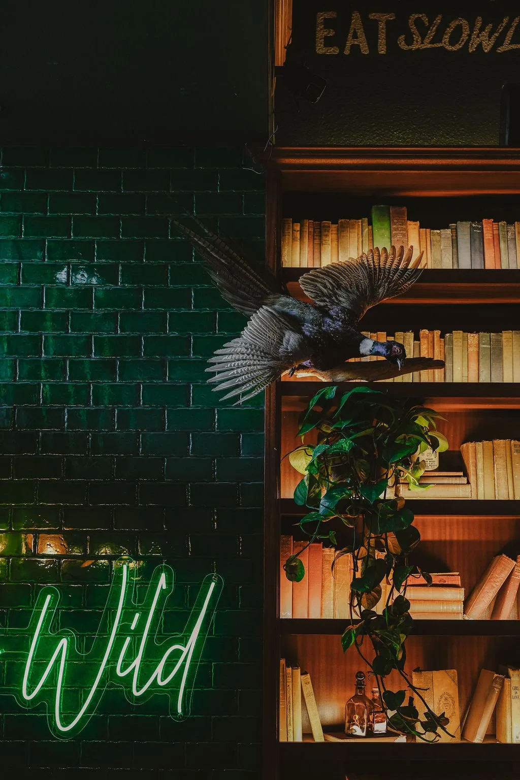
Dark woods, amber light, greenery, vintage books, collected objects, and richly layered details helped turn the space into something transportive rather than simply decorated. The goal was to make it feel discovered, not manufactured.
DESIGNED & SOURCED
Custom bookshelf construction, Moss FERAL wall art, BOOK WALL ART, Furniture, Lighting fixtures, Decor curation, Signage
BRAND APPLICATIONS
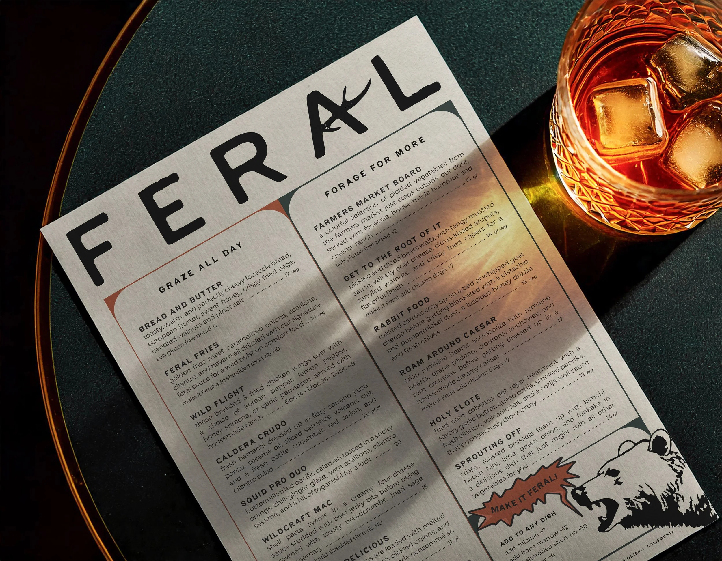
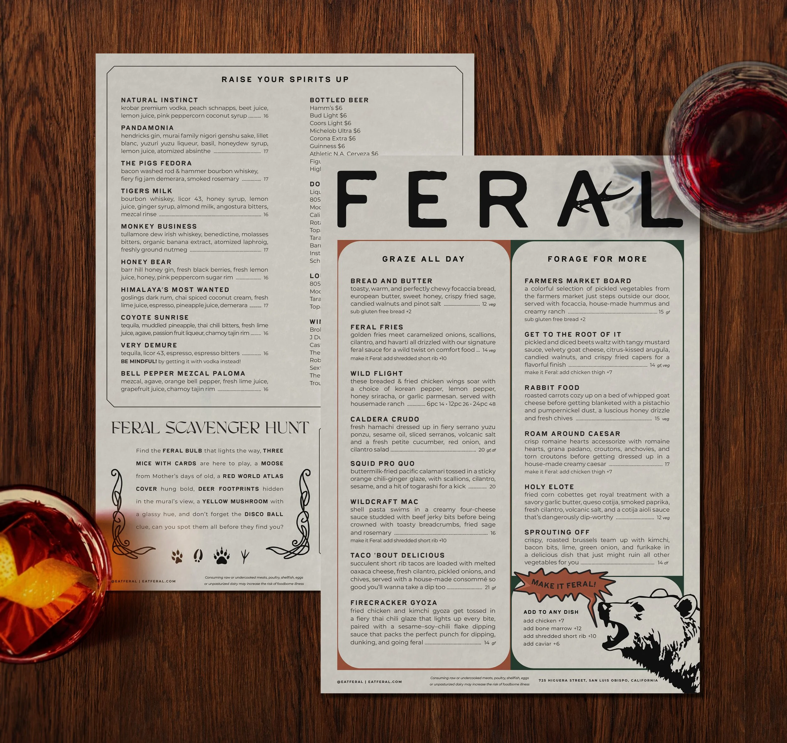
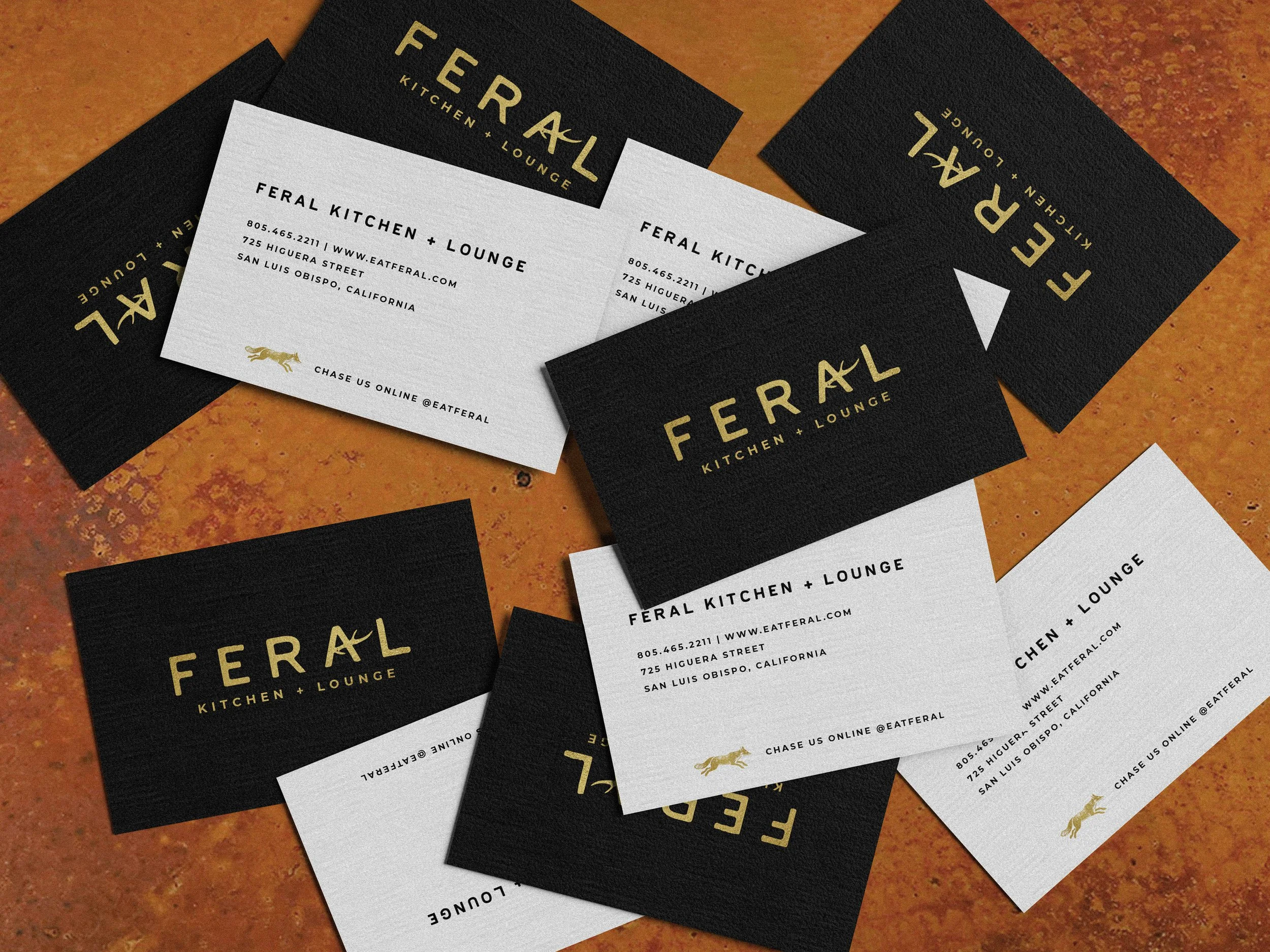
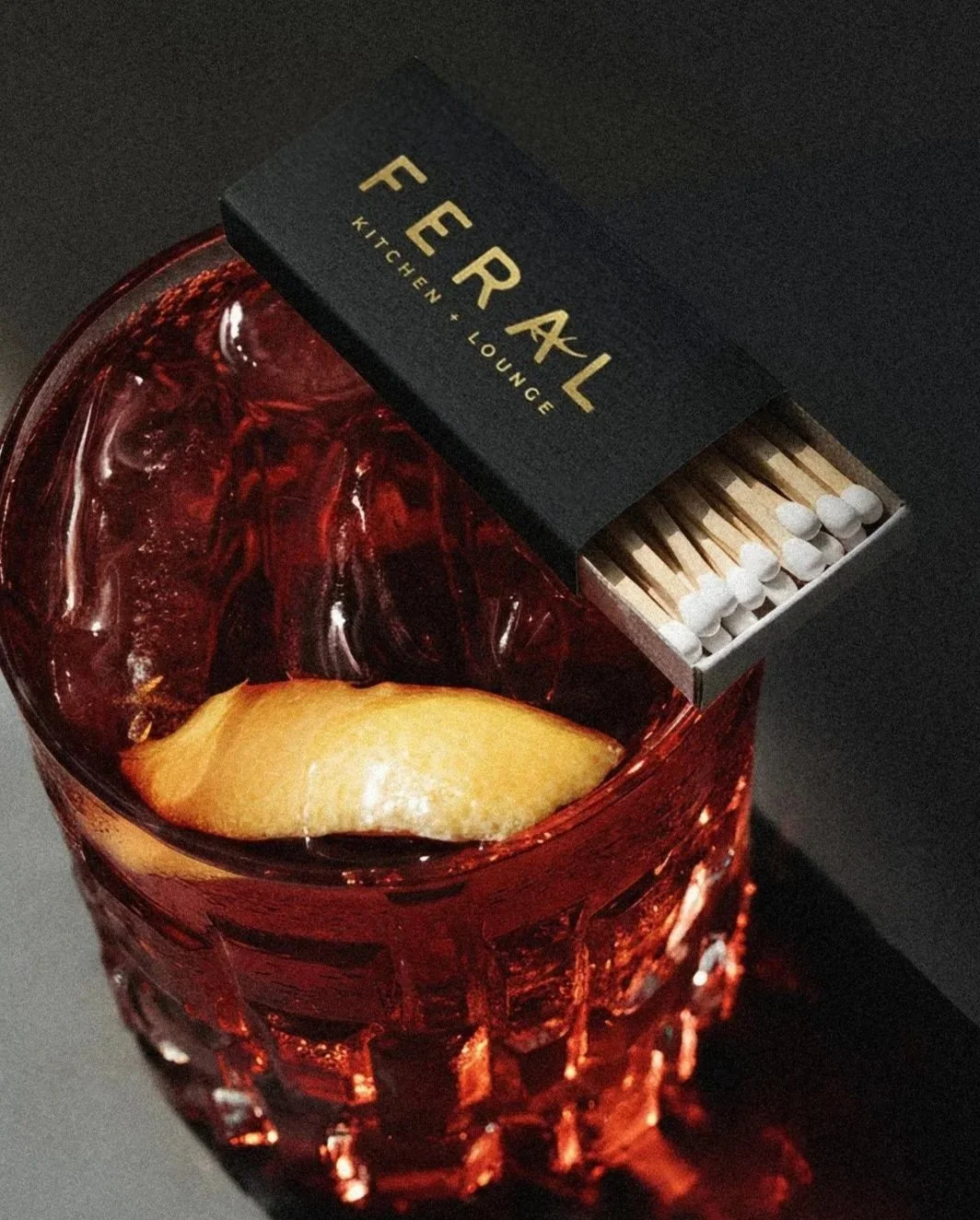
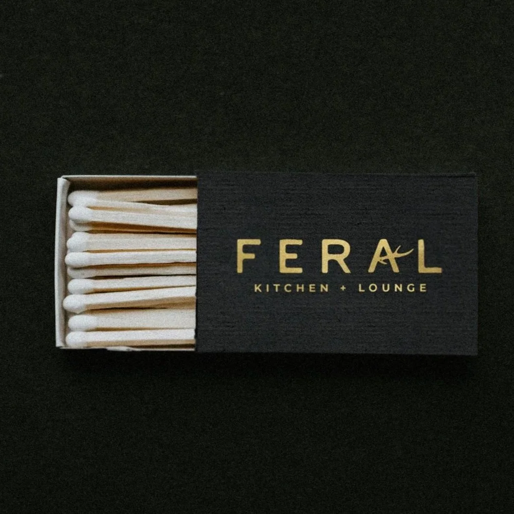
Menus, signage, and printed materials extend the identity into tactile guest touchpoints throughout the space. Textured papers, bold layouts, and gold accents keep the system cohesive across everything from matchboxes and business cards to coasters and menus — each piece designed to reinforce the same tension at the center of the brand: polished, atmospheric, and a little wild.
Even the menu includes a branded scavenger hunt, an extension of the brand's invitation to slow down and explore.
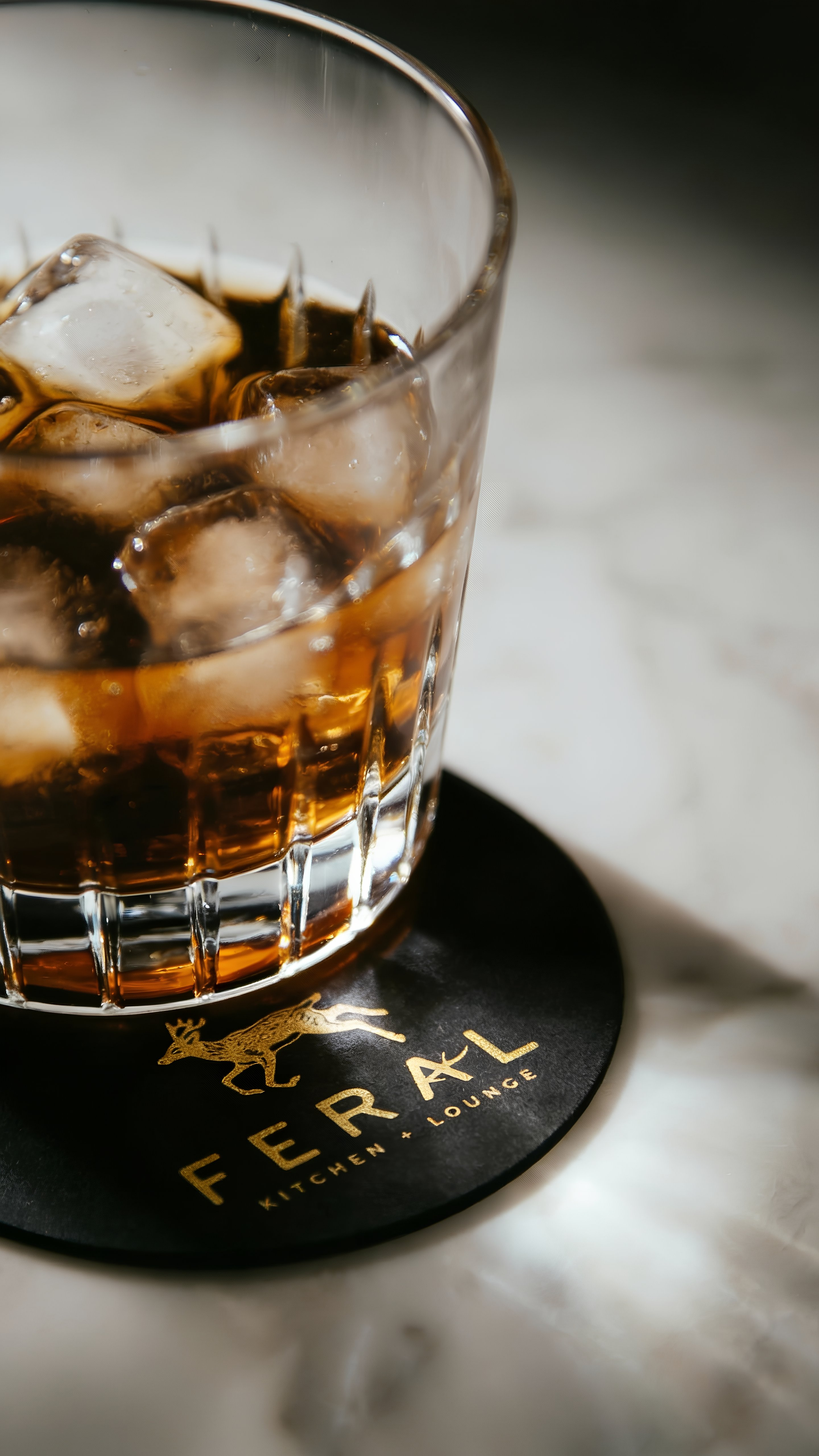
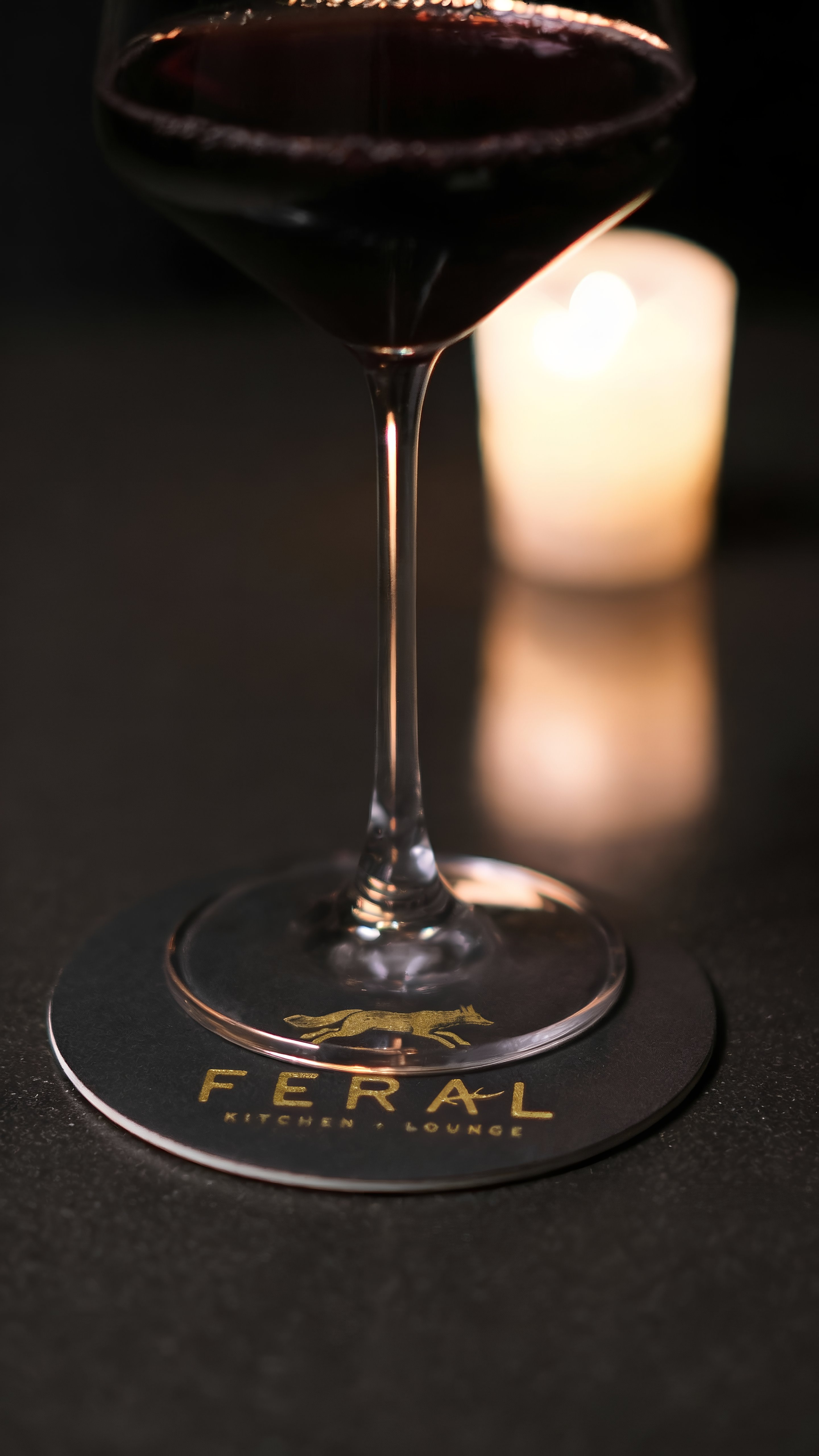
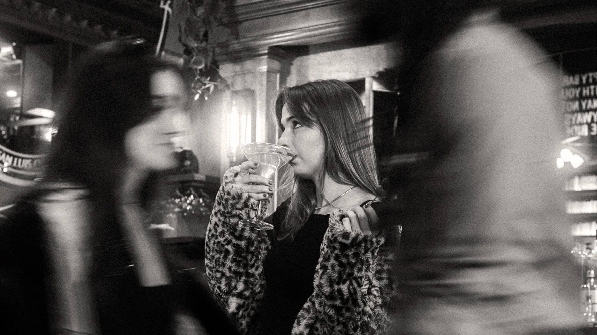
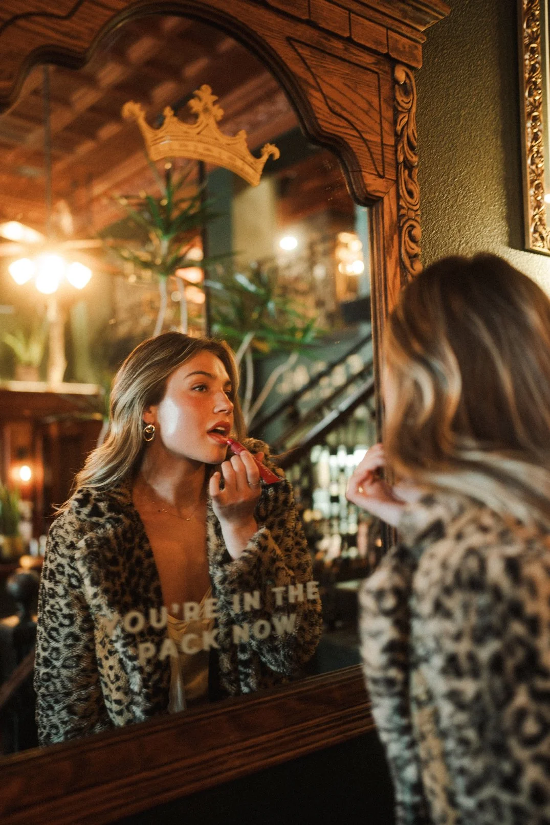
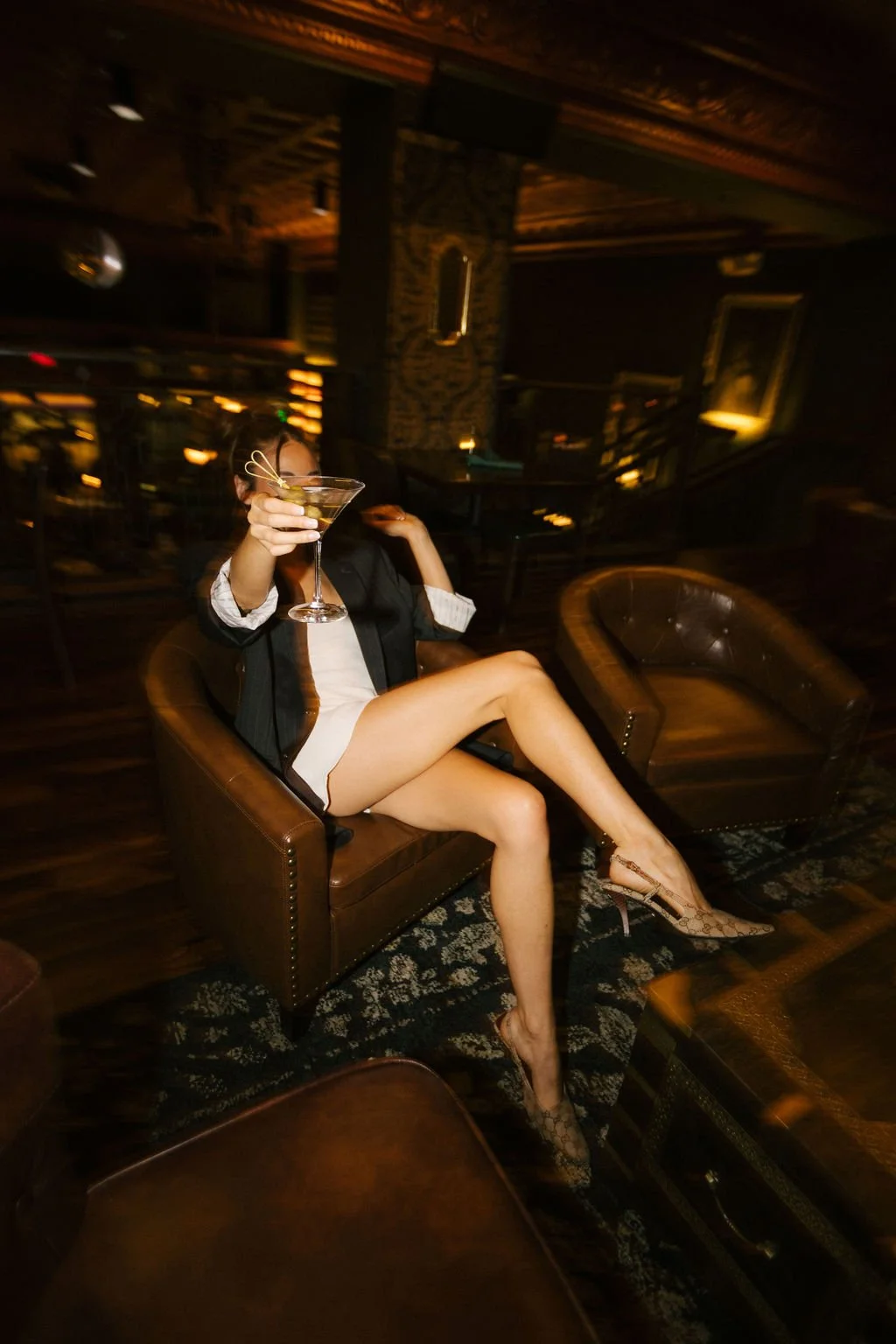
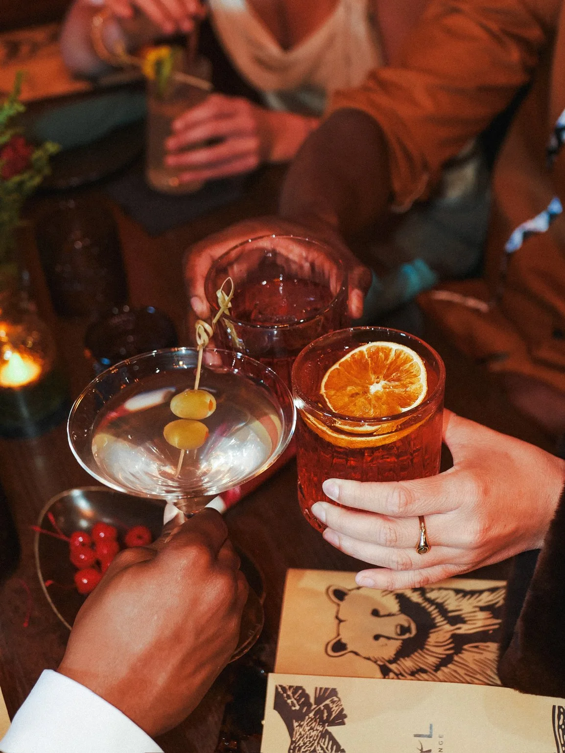
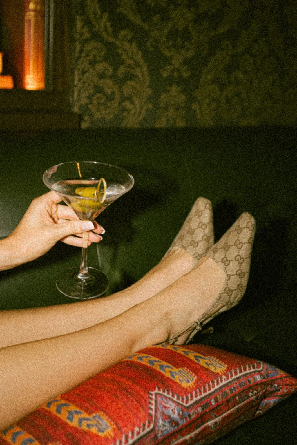
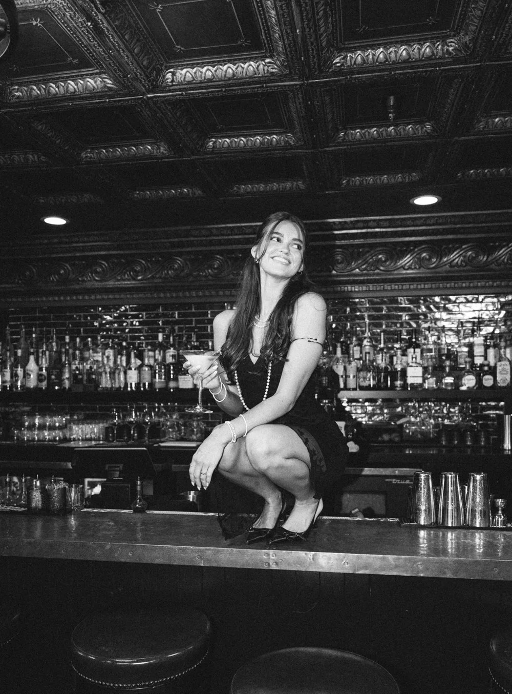
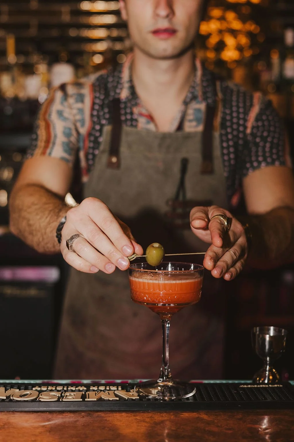
PHOTOGRAPHY ART DIRECTION
Photography played a critical role in translating the brand beyond the physical space itself. I directed imagery to preserve the same tone present in the identity and interiors — cinematic, warm, seductive, and slightly unruly — so the digital impression matched the in-person experience.
The visual storytelling needed to capture more than aesthetics alone. It needed to communicate energy, intimacy, and the feeling of stepping into a fully authored world.
OUTCOME
FERAL became a full conceptual reset — an identity strong enough to separate a new hospitality experience from the baggage of the old space. Across brand, print, interiors, and imagery, the project was designed to feel immersive, memorable, and cohesive at every touchpoint.
Built through pivots, constraints, and instinct, the final result became a richer and more distinct brand world than the original concept had ever promised.
PRESS
PROJECT SCOPE
BRAND IDENTITY
SIGNAGE & ENVIRONMENTAL
INTERIOR DESIGN
MENU DESIGN
PRINT COLLATERAL
MERCHANDISE
PHOTOGRAPHY DIRECTION
COPYWRITING
SECTOR
HOSPITALITY
COLLABORATORS