

-
Colony Sandwich Co. is a laid-back neighborhood hub in a revitalized 1950s gas station in Atascadero, where locals gather for stacked-high sandwiches, house-made sauces, duck fat fries, cold beers, and effortless all-day hangs.
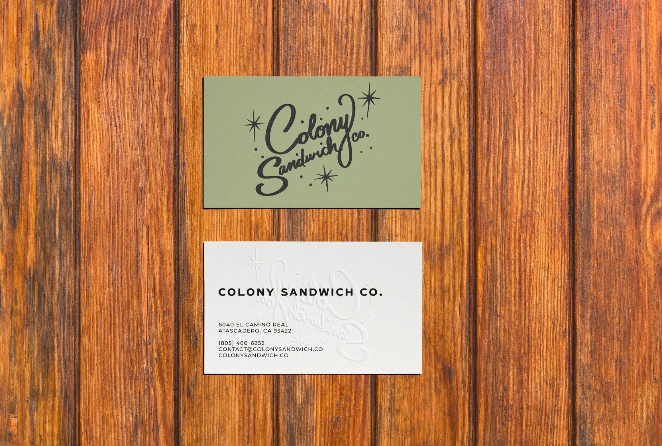
The brand identity and collateral for this family-run revival draws from the building’s geometric breeze blocks, natural textures, and nostalgic roadside roots while staying clean and approachable.
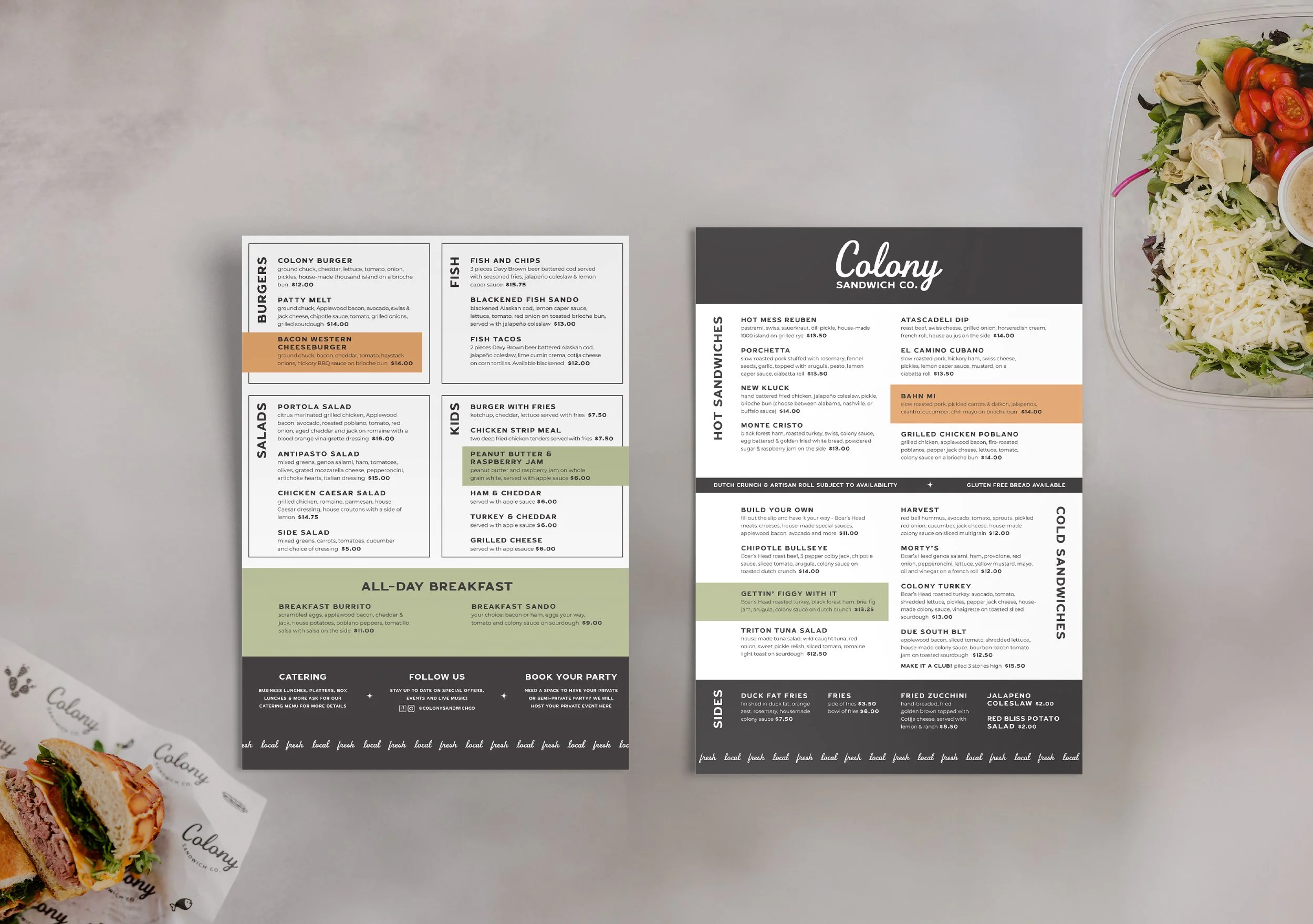
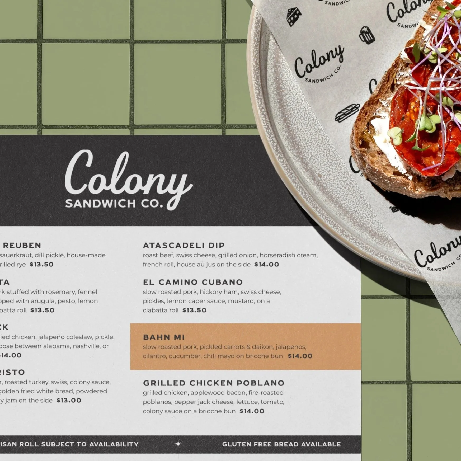
The name evokes Atascadero’s historic planned-community spirit—shared place and easy camaraderie. The custom wordmark in Beverly Drive, a retro script with elegant curves, feels timeless and inviting. It pairs with Duhline Sans for sturdy, readable hierarchy.
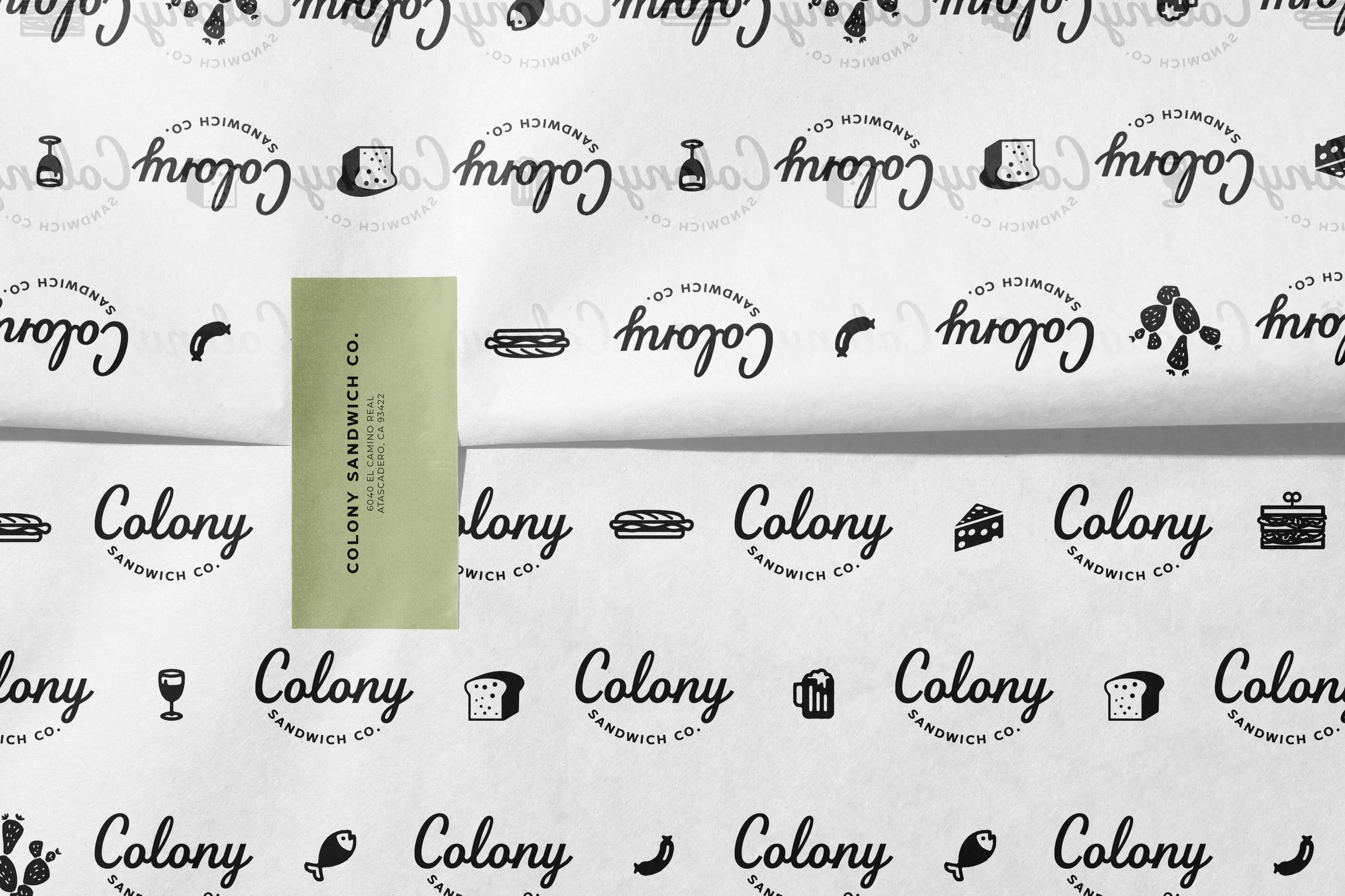
Graphic elements stay minimal with simple line icons of sandwiches, fries, drinks, and other staples add subtle playfulness.
The restrained palette—crisp white, deep black, soft mint, warm valencia orange—mirrors the food and space: fresh, appetizing, sunny.
Colony is neither rushed counter nor upscale—it’s the perfect in-between. A gathering place for bold flavors, laughter, and unhurried Central Coast rhythm.
COLONY SANDWICH CO.
Brand identity and spatial vision for Colony Sandwich Co., breathing life into a vintage gas station as a gathering place for bold sandwich stacks, shared laughter, and the vibrant joy of coming together over seriously good food.
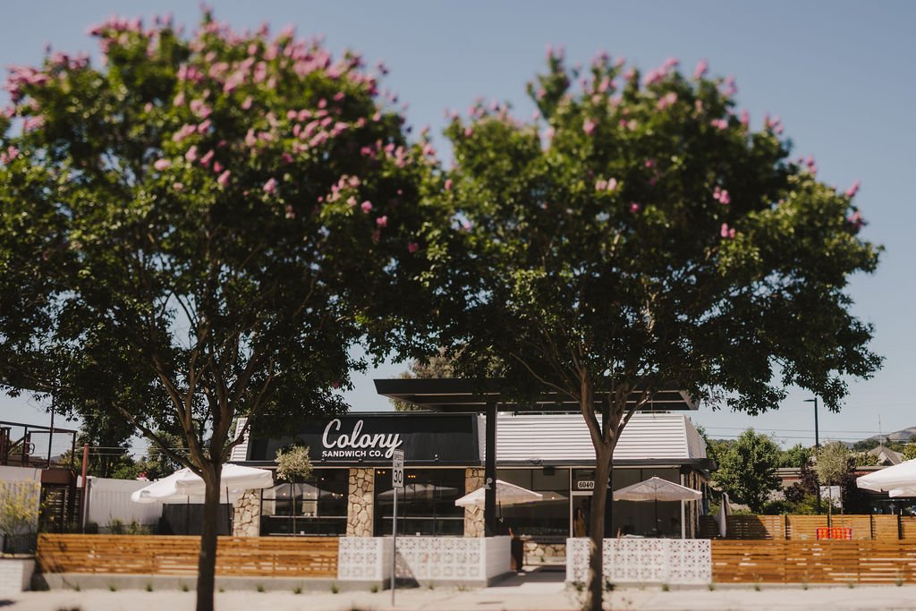
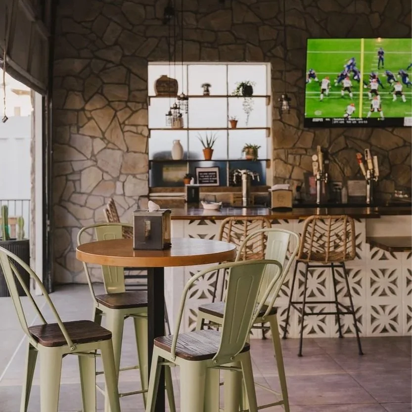
Interior direction emphasizes openness, warmth, and effortless layering—crafted for casual, sunlit days and lingering neighborhood hangs. Natural daylight floods through rolled-up garage doors, creating bright, airy depth; midcentury breeze block patterns and preserved stone walls add geometric texture and historic character; picnic tables, exposed beams, and string lights blur boundaries between indoor comfort and outdoor rhythm.

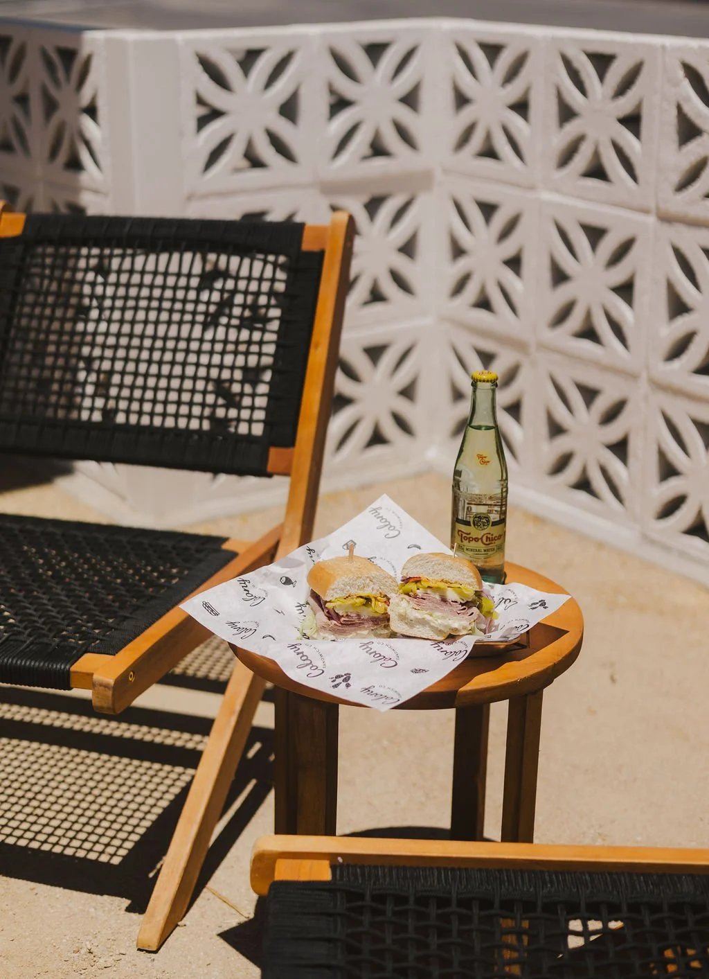
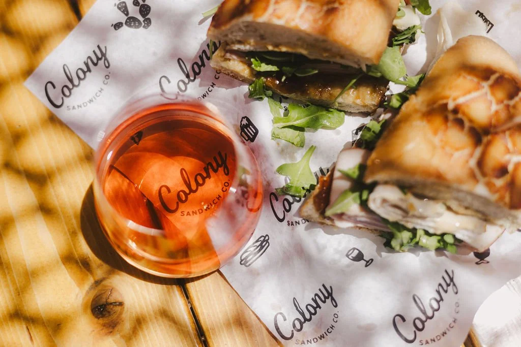
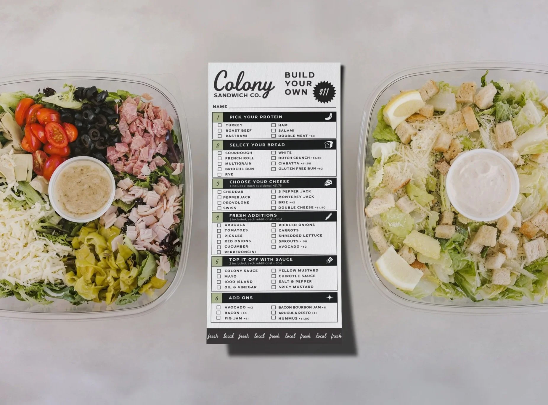
Menus, signage, and printed materials extend the identity seamlessly—inviting touch through textured papers and refined finishes. Bold layouts highlight shareable plates; gold accents elevate merch and glassware. The system maintains cohesion from digital to physical.
PROJECT SCOPE
BRAND IDENTITY
SIGNAGE & ENVIRONMENTAL
SECTOR
HOSPITALITY
COLLABORATORS