
-
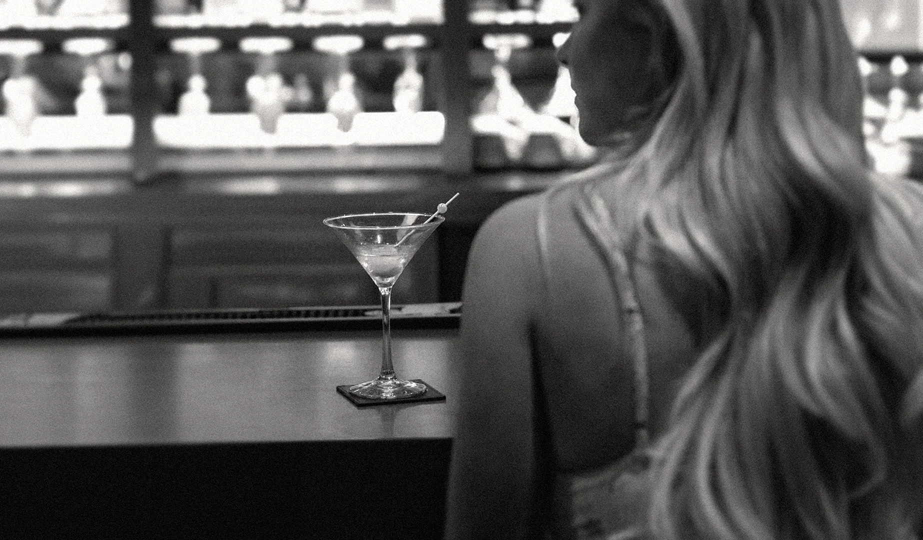
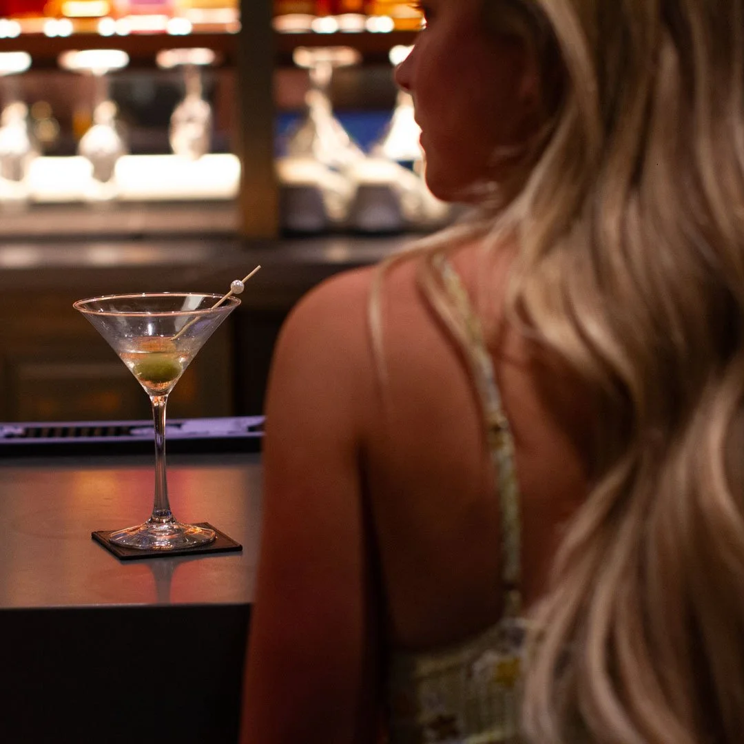
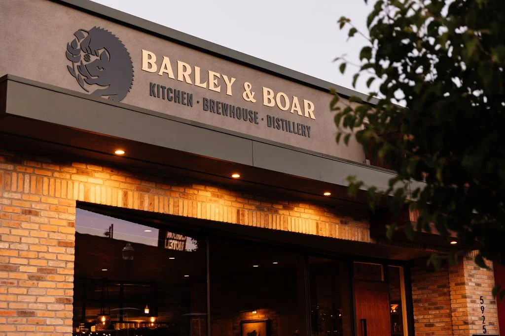
Barley & Boar is a farm-to-table kitchen, brewhouse, and distillery rooted in the Central Coast of California. When the restaurant expanded into producing their own small-batch spirits, the packaging needed to feel as craft and place-specific as the product itself — honest, premium, and distinctly Central Coast.
Two previous design directions had been rejected before this one was chosen.
BARLEY & BOAR DISTILLERY
Label and packaging design for an in-house distillery created for Barley & Boar, a farm-to-table restaurant, brewery, and open-kitchen concept in Atascadero, California.
ROLE
Packaging Design, Label Design, Brand Extension, Sales Materials, COPYWRITING
INDUSTRY
Hospitality / Spirits
OVERVIEW
Barley & Boar’s distillery line needed packaging that felt connected to the restaurant’s identity while standing on its own as a retail-ready product. The final direction had to balance craft, regional character, and shelf presence across both vodka and gin.
I joined the project after multiple earlier design directions had already been explored. My concept was ultimately selected and developed into the final label and packaging system for the distillery line.
DESIGN DIRECTION
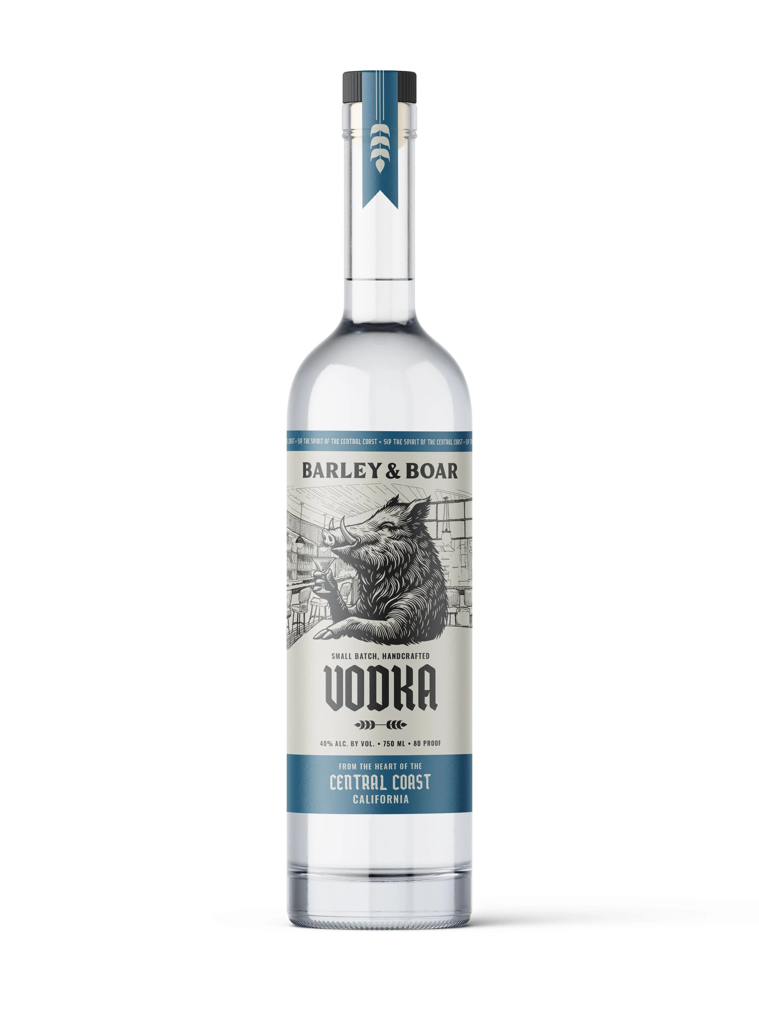
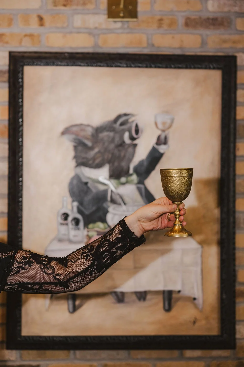
The goal was to create a system that felt rooted in Barley & Boar’s personality: bold, handcrafted, and tied to the Central Coast. The final design pairs vintage-inspired typography with illustrated detail and a restrained color system to give each spirit its own identity while keeping the line cohesive.
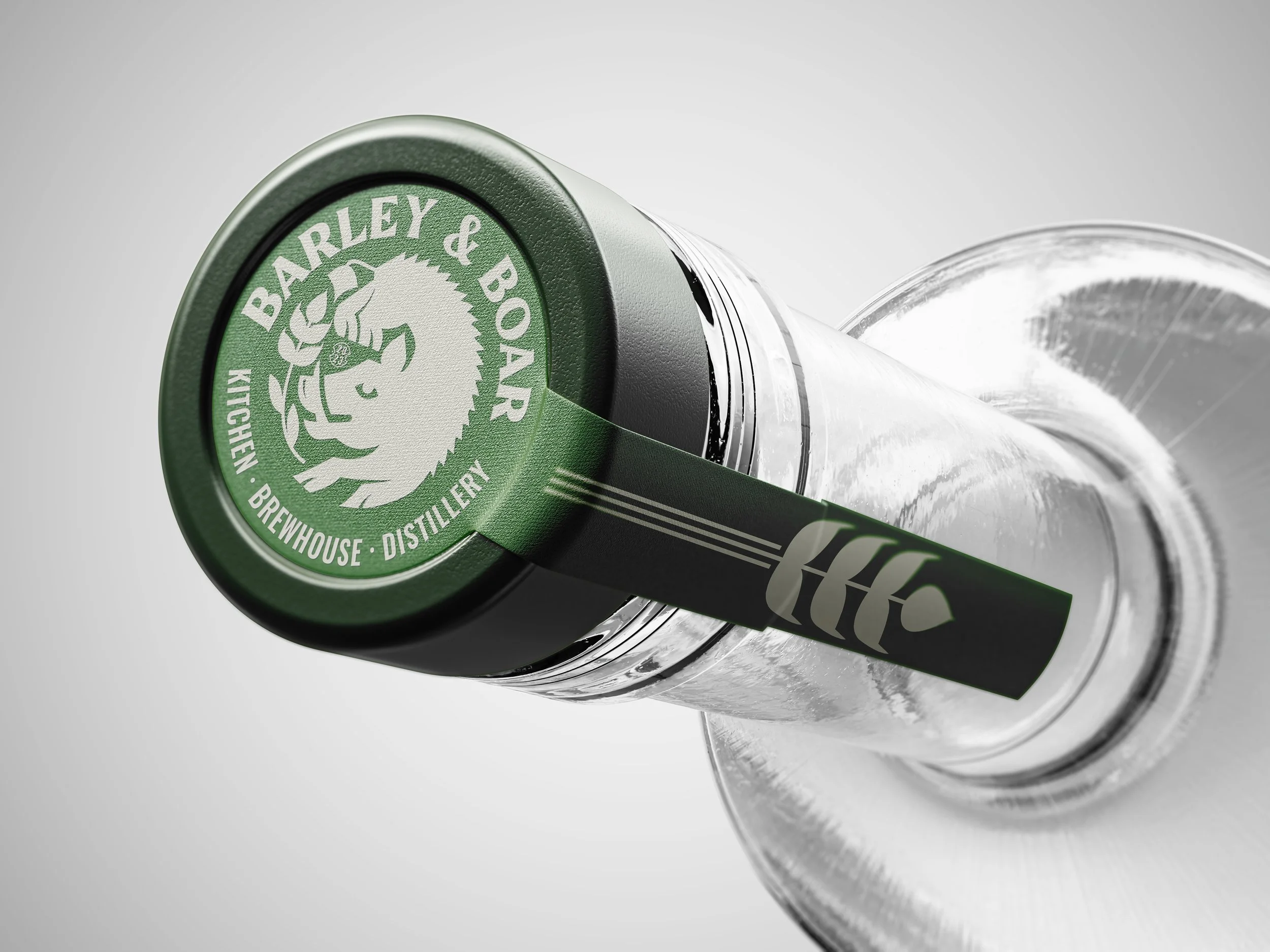
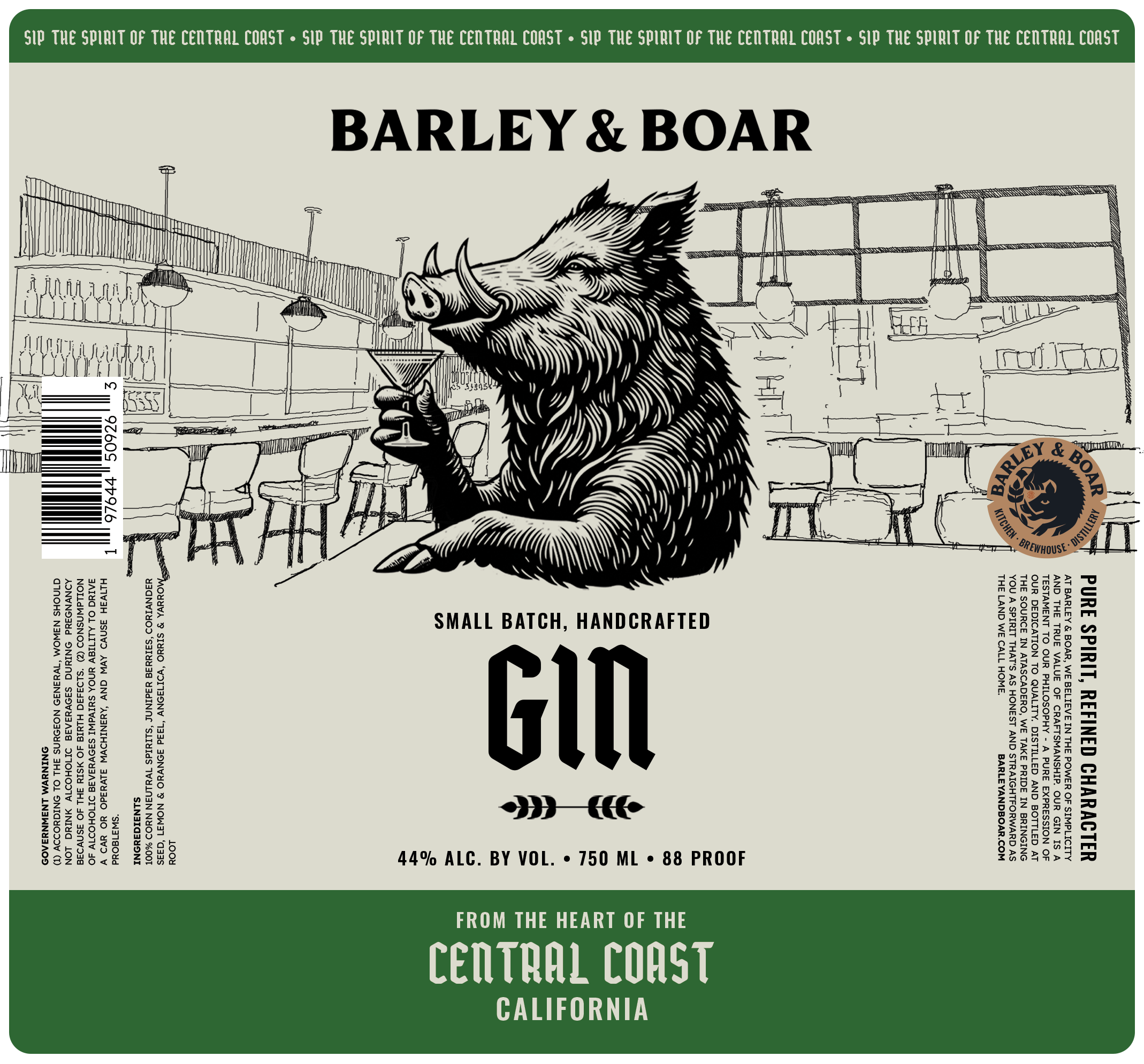
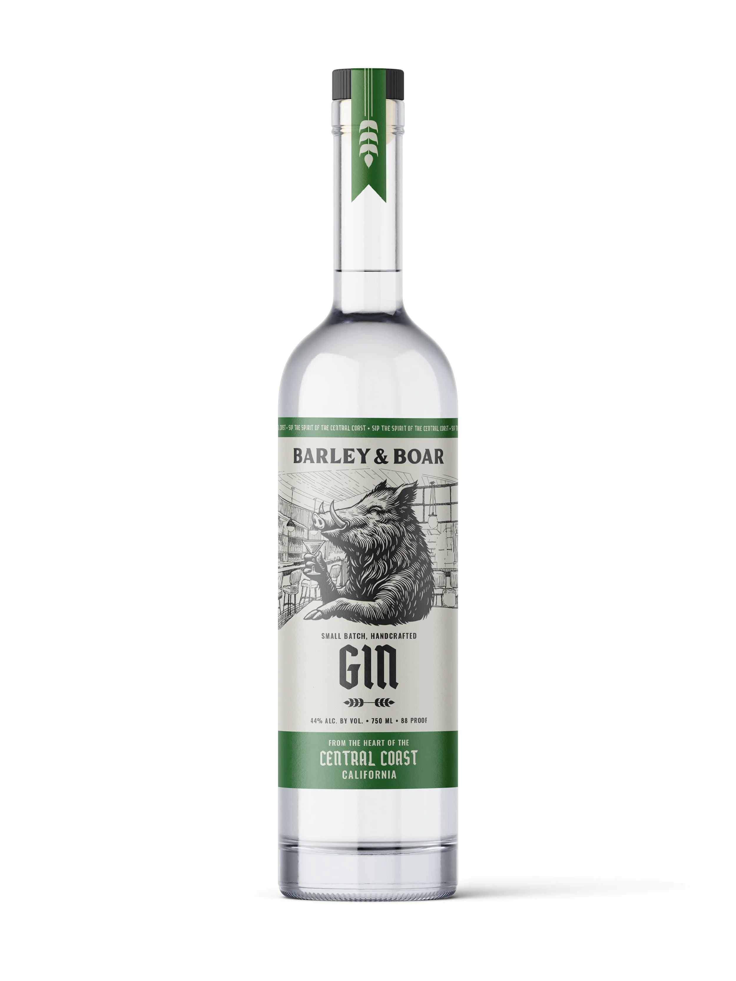
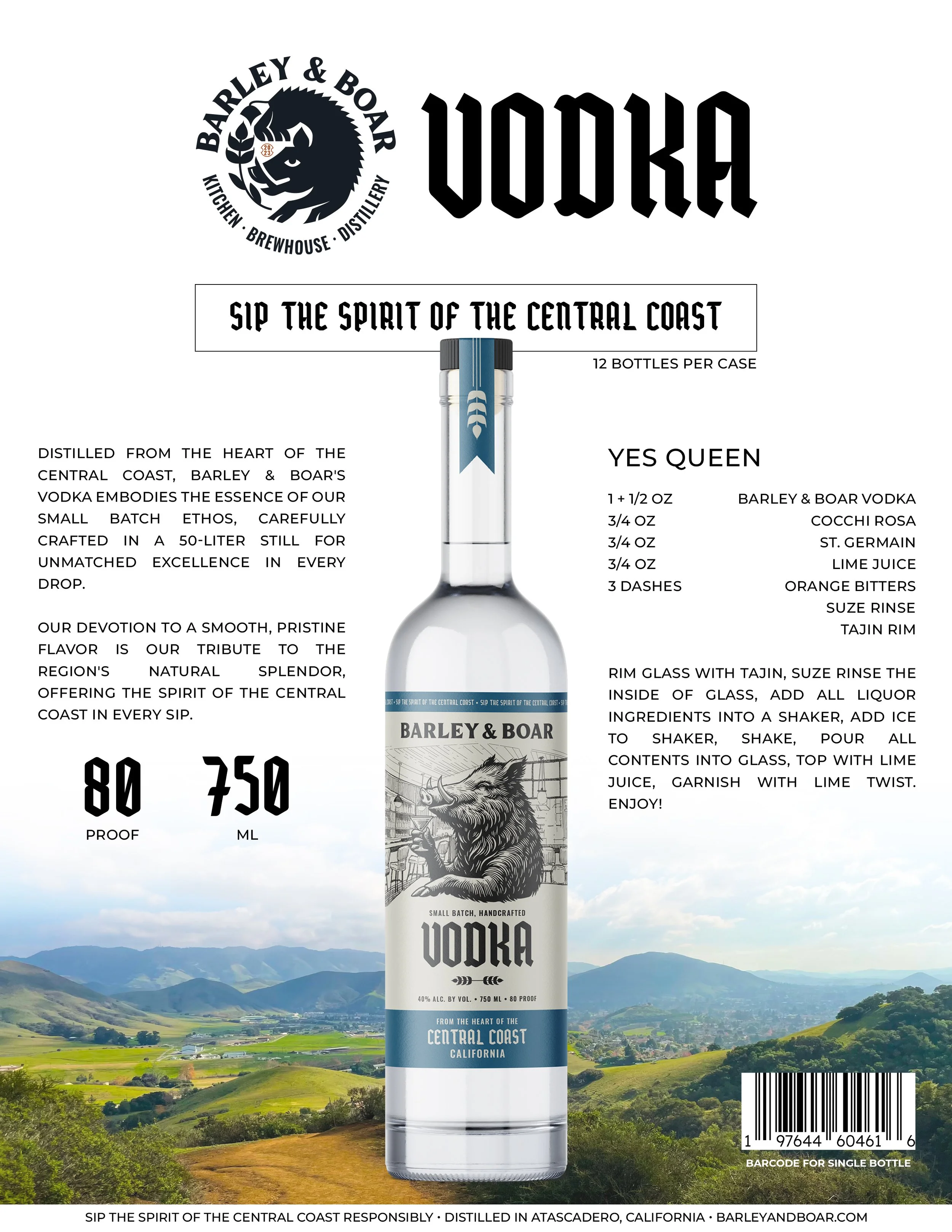
The boar illustration became the anchor of the label, bringing character and storytelling to the product without losing clarity or shelf impact. Blue and green colorways helped distinguish vodka from gin while preserving a unified visual language across the full system.
LABEL SYSTEM
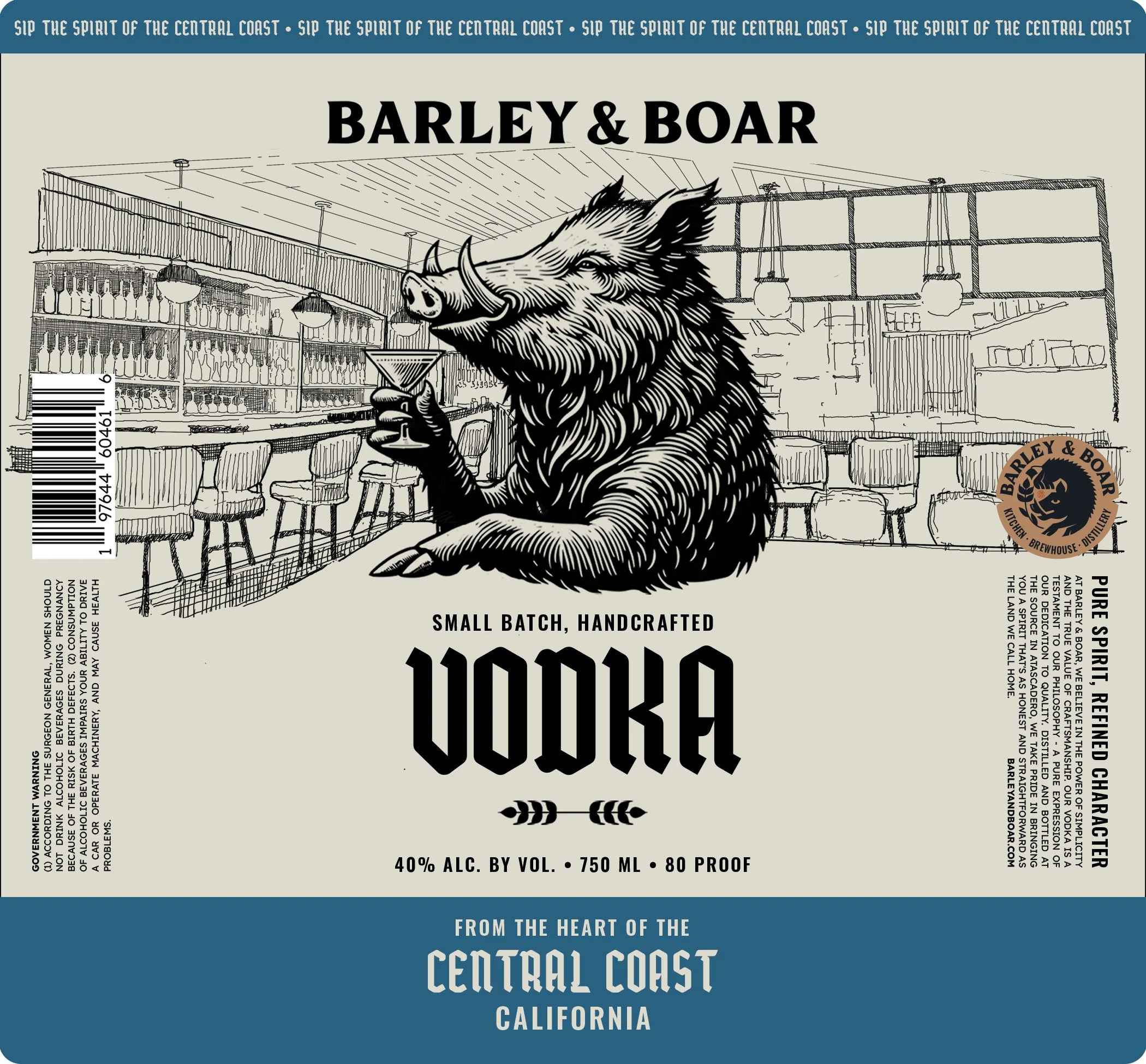
The brief called for something that felt modern but carried old world character — a tension the existing logo already held, but hadn't been fully translated into packaging. Two previous directions hadn't landed. The solution was to lean into what the brand already had: the boar.
I drew a new, fully detailed engraved illustration from scratch — the boar seated at the bar, holding a martini — placing the brand's identity literally inside its own space. The cream ground, bold hierarchy, and color-coded band system kept the line feeling premium and cohesive across vodka and gin, with enough distinction between the two to read as a collection rather than a copy.
DESIGNED & PRODUCED
Label illustration — Vodka label, Gin label, COPYwriting
TYPOGRAPHY
MORDOVA, OSWALD
Packaging + Sales Materials
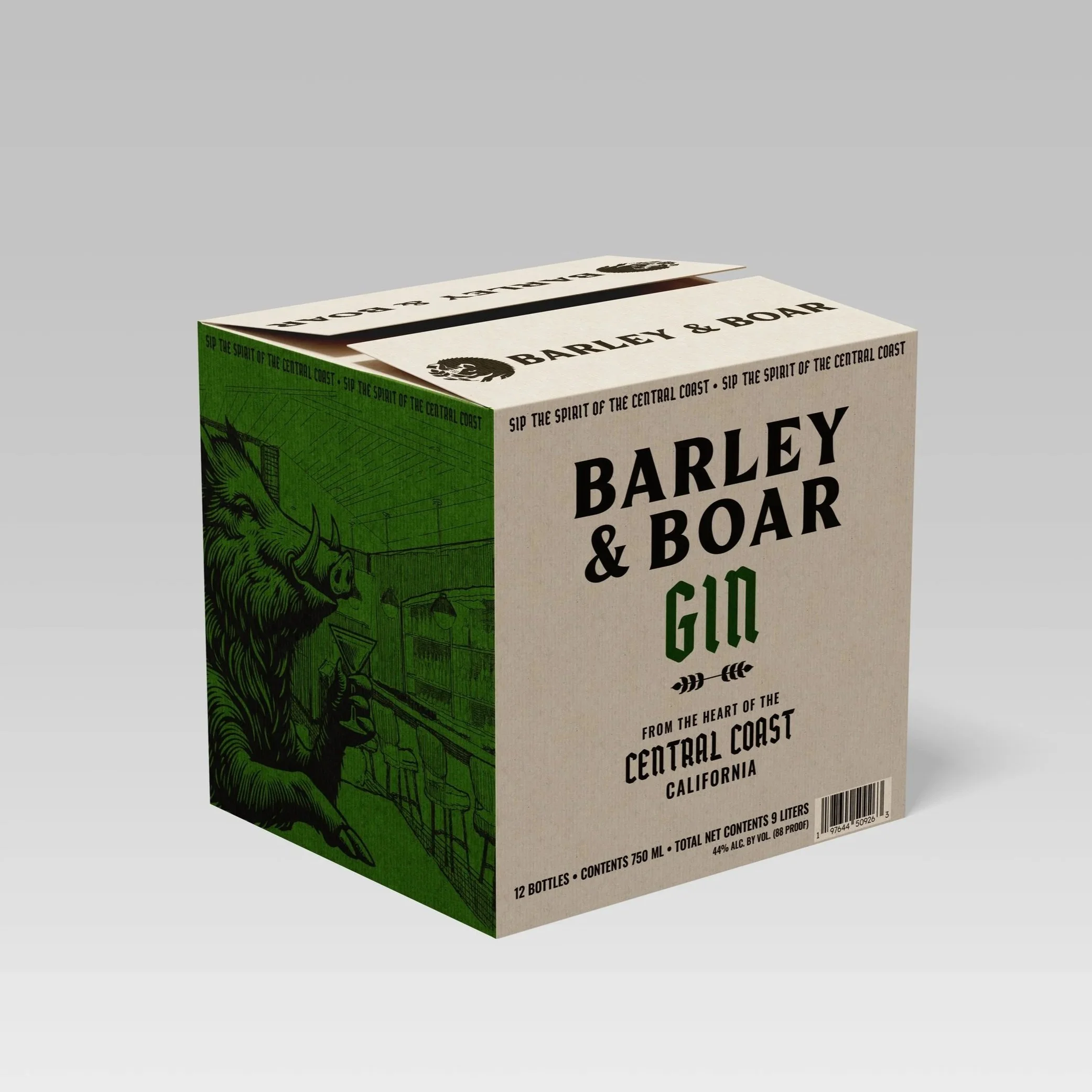
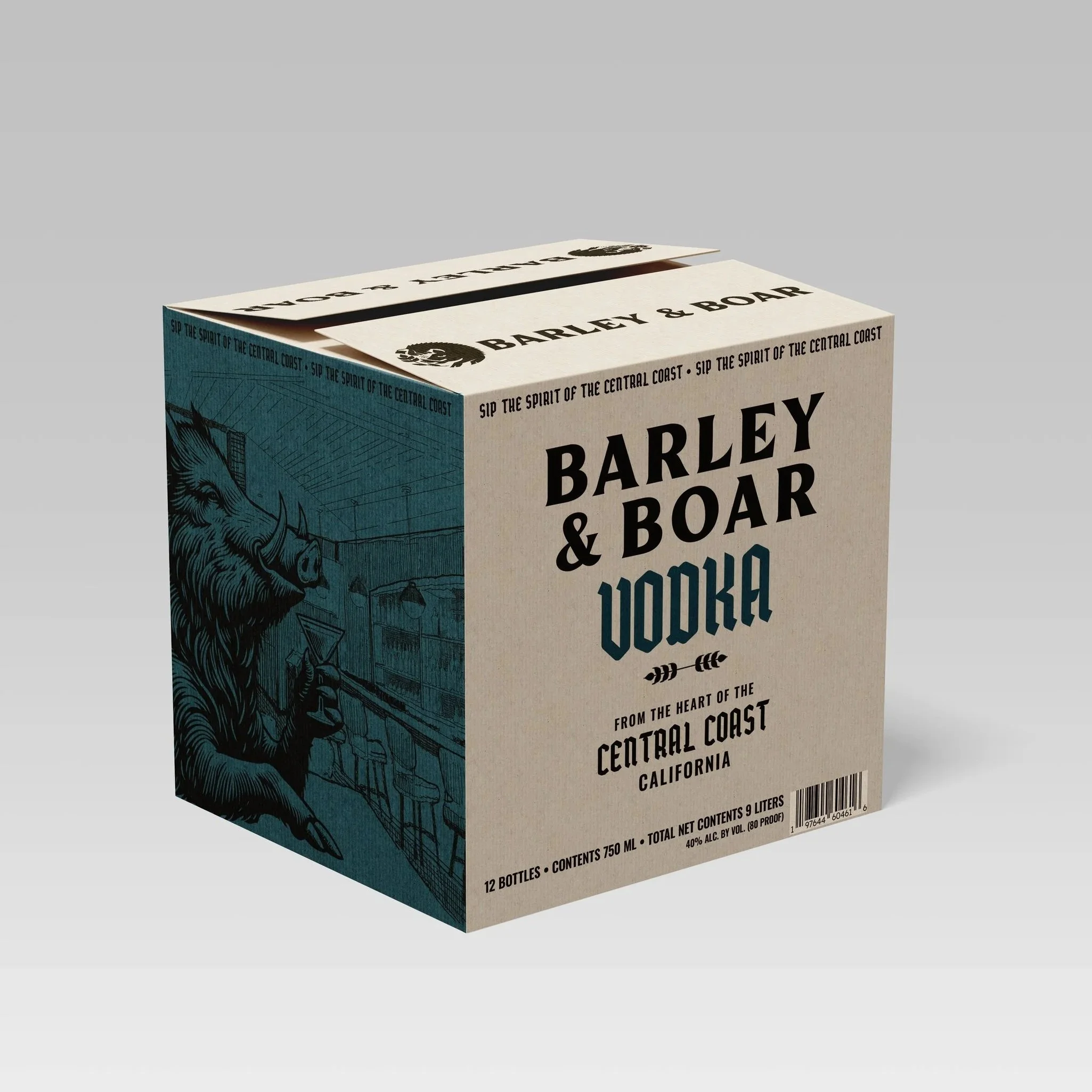
Beyond the bottle itself, the system extended into supporting packaging and promotional materials designed to help the product function both operationally and commercially. Outer case packaging carried the same visual language into distribution, while the sell sheet translated the product story into a more market-facing format.
Together, these pieces helped turn the distillery line into a more complete brand expression rather than a label-only exercise.
DESIGNED & PRODUCED
Vodka & gin shipping boxes, Distributor sell sheets, Trade advertising

OUTCOME
The final direction gave Barley & Boar’s distillery line a clearer visual identity—one that felt connected to the restaurant’s broader brand while distinct enough to stand on its own in packaging form. Across labels, boxes, and supporting materials, the system brought stronger cohesion, character, and polish to the launch of the spirits line.
PROJECT SCOPE
PACKAGING DESIGN
LABEL DESIGN
BRAND EXTENSION
SALES MATERIALS
COPYWRITING
SECTOR
HOSPITALITY/SPIRITS
COLLABORATORS