

-
What began as Helena Farm Stop — an ambitious plan to bring a dedicated local-food grocery to downtown Helena's walking mall — pivoted when the lease fell through and the owner found a new home inside an existing scratch kitchen. The result was something richer: The Market at Benny's, a Montana-rooted local food market tucked inside Benny's Bistro on East 6th, where the mission stayed the same even as the form changed. Farmers keep 70% of every sale. Local food stays local.
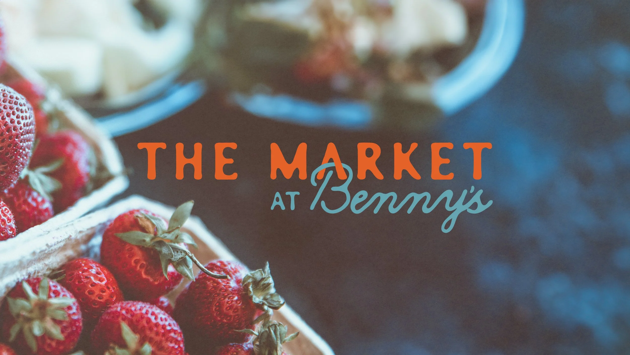
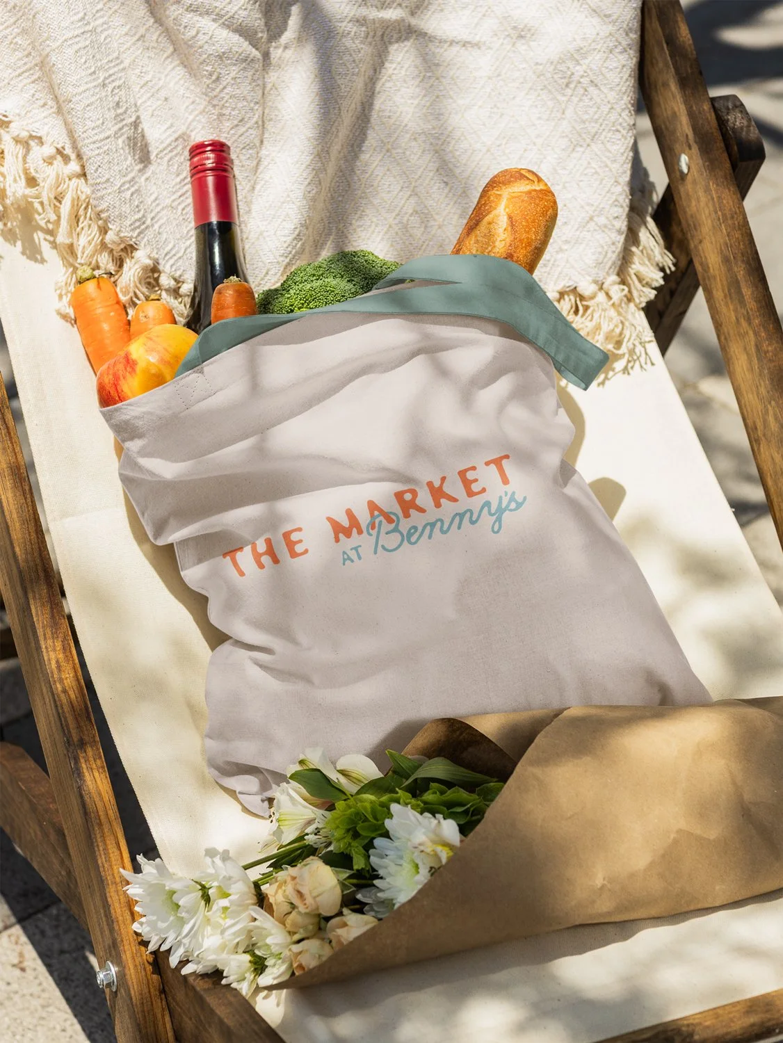
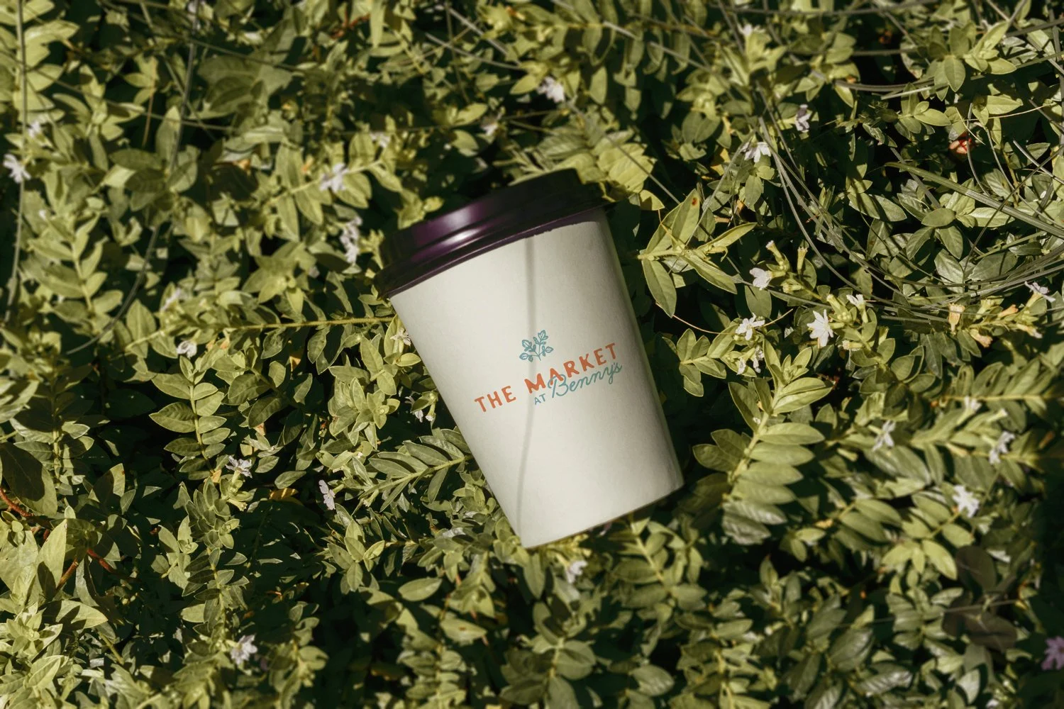
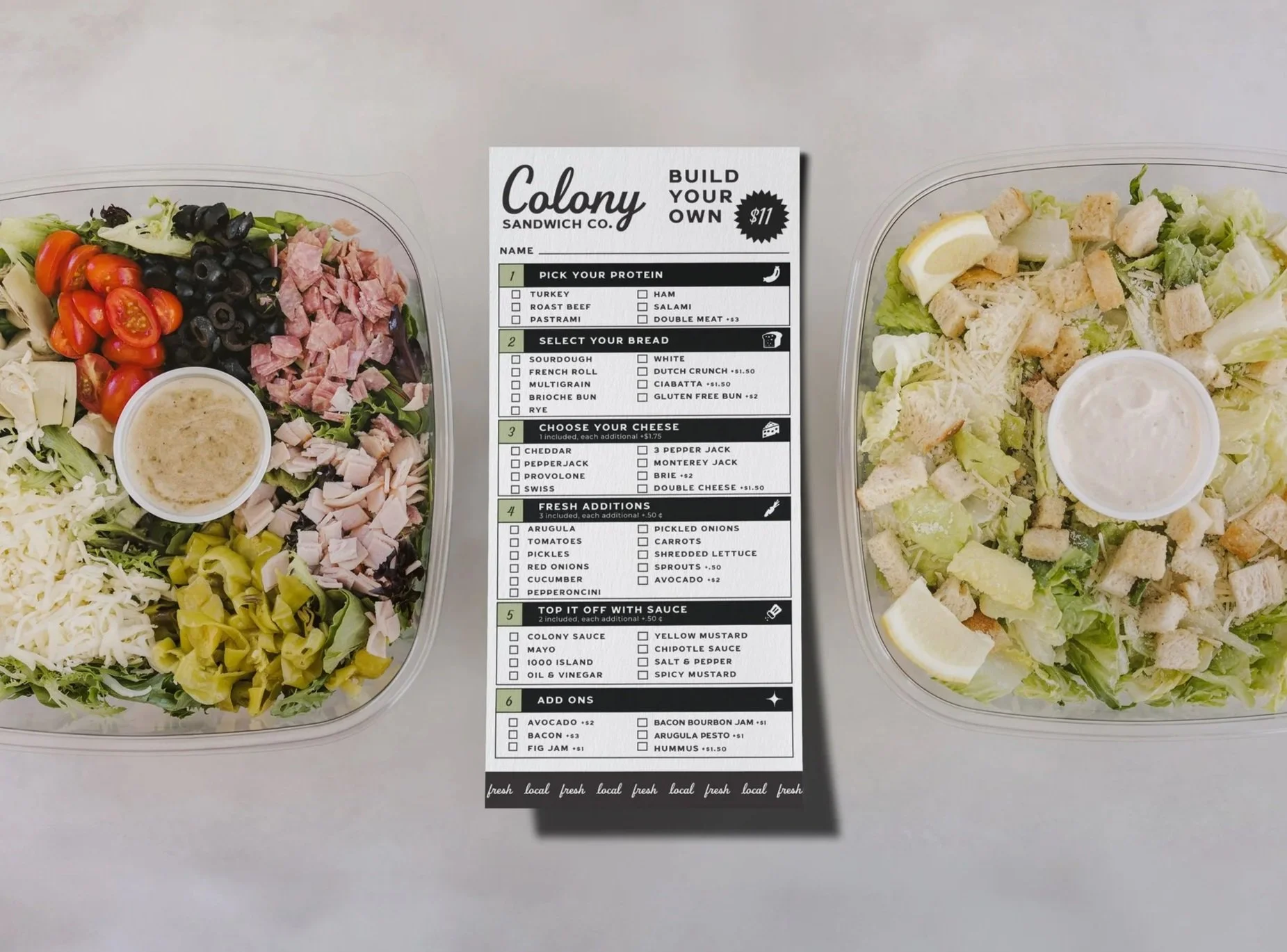
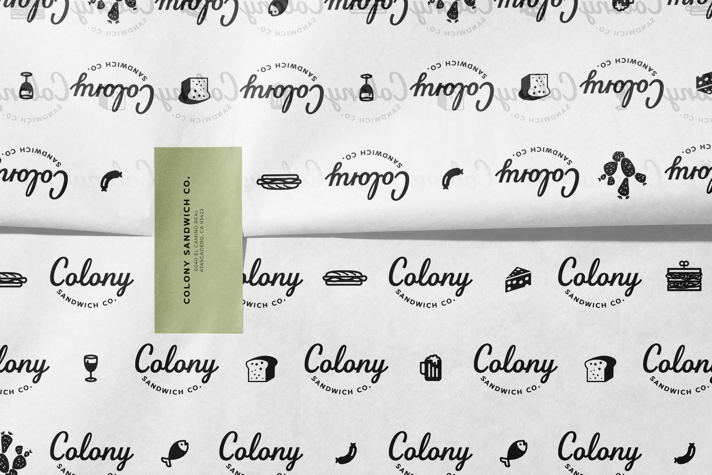
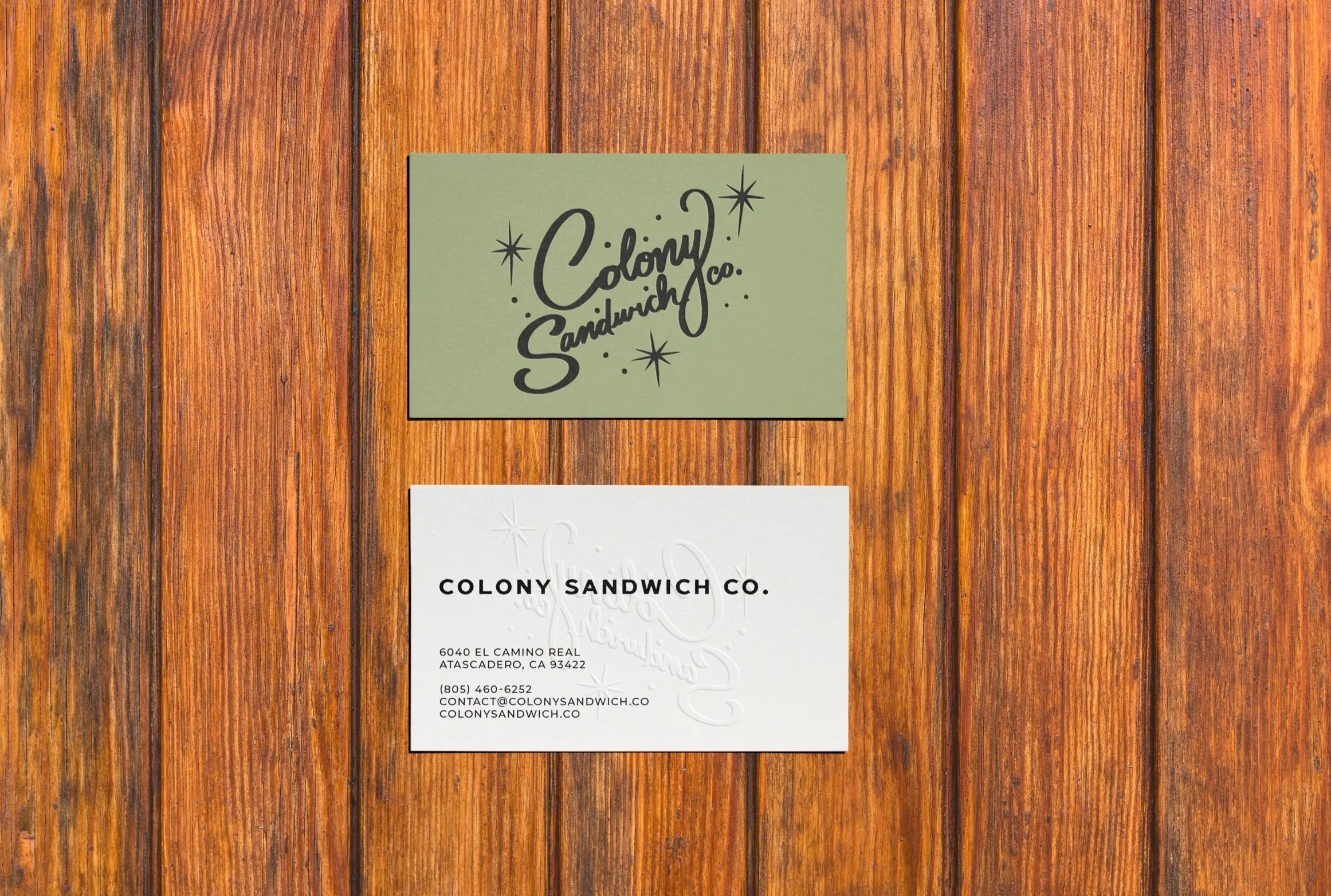
Two brands emerged from one vision. Helena Farm Stop's identity is rooted and utilitarian — bold hand-lettered type anchored by a wheat stalk and a circular badge mark, built to feel like it belongs on a roadside sign or a grain sack. The Market at Benny's softens that into something warmer — a hand-lettered display face pairs with a flowing script, and simple icons of produce, jars, and market staples add quiet personality throughout.
The palette draws directly from the harvest: warm cream and golden wheat for the land, dusty sky blue for wide Montana skies, deep olive for late-season greens, and burnt orange for the tomatoes and peppers that bring an earthy sweetness. This is a brand built around a simple belief — that local food shouldn't be a luxury. It should just be the way things are.
THE MARKET AT BENNY’S
Brand identity for Benny's Bistro and The Market at Benny's, breathing life into a vision that started as a farm stop and grew into something richer — a sit-down kitchen and local food market in the heart of Helena, Montana, built around farmers, community, and the radical idea that good food should stay close to home.
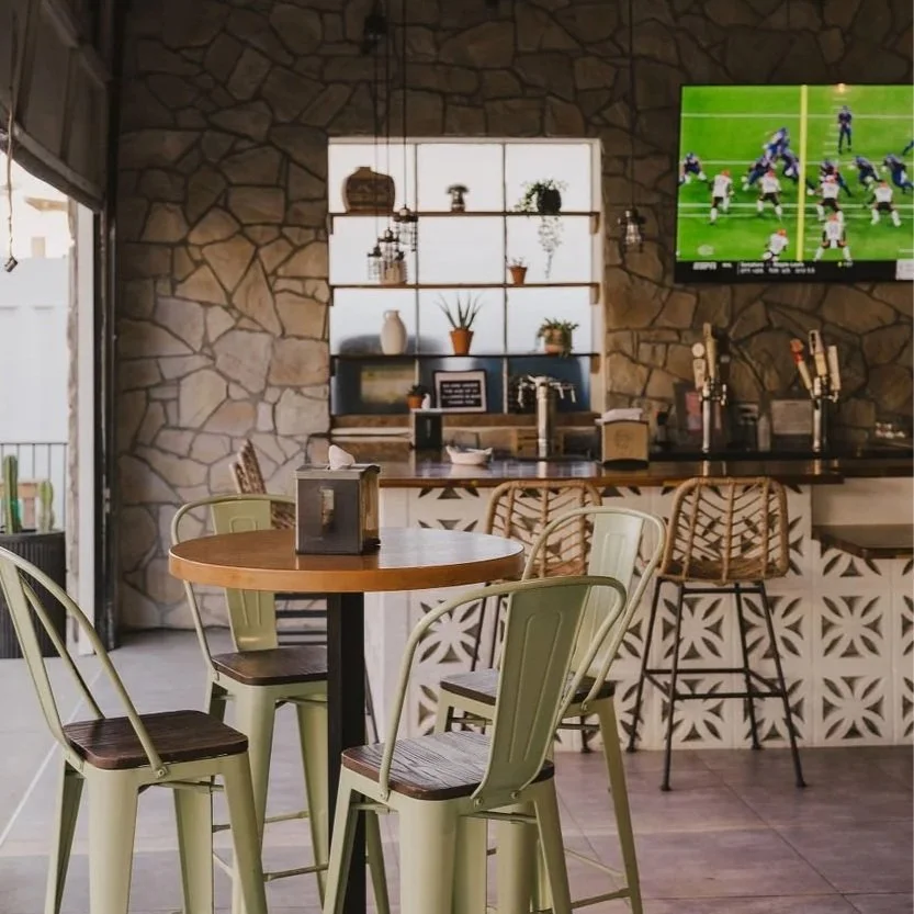
Interior direction emphasizes openness, warmth, and effortless layering—crafted for casual, sunlit days and lingering neighborhood hangs. Natural daylight floods through rolled-up garage doors, creating bright, airy depth; midcentury breeze block patterns and preserved stone walls add geometric texture and historic character; picnic tables, exposed beams, and string lights blur boundaries between indoor comfort and outdoor rhythm.

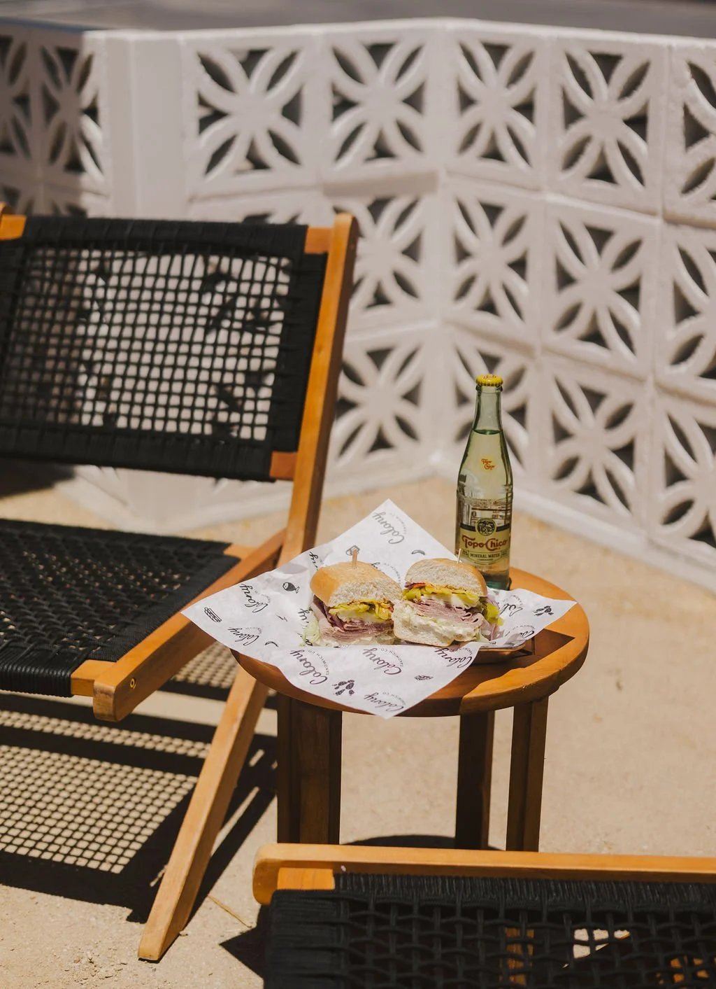
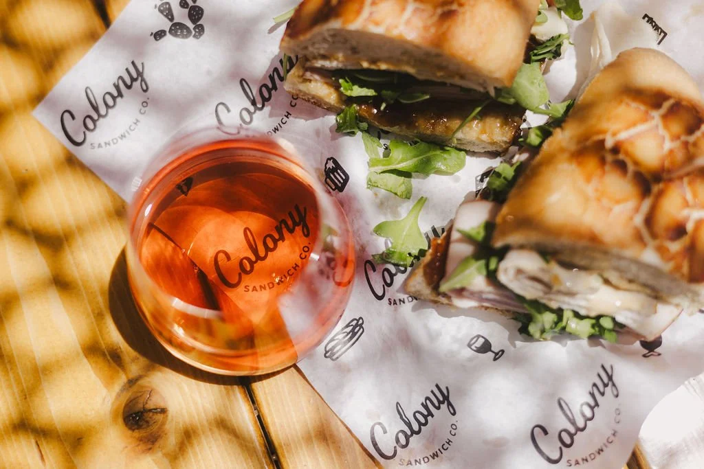
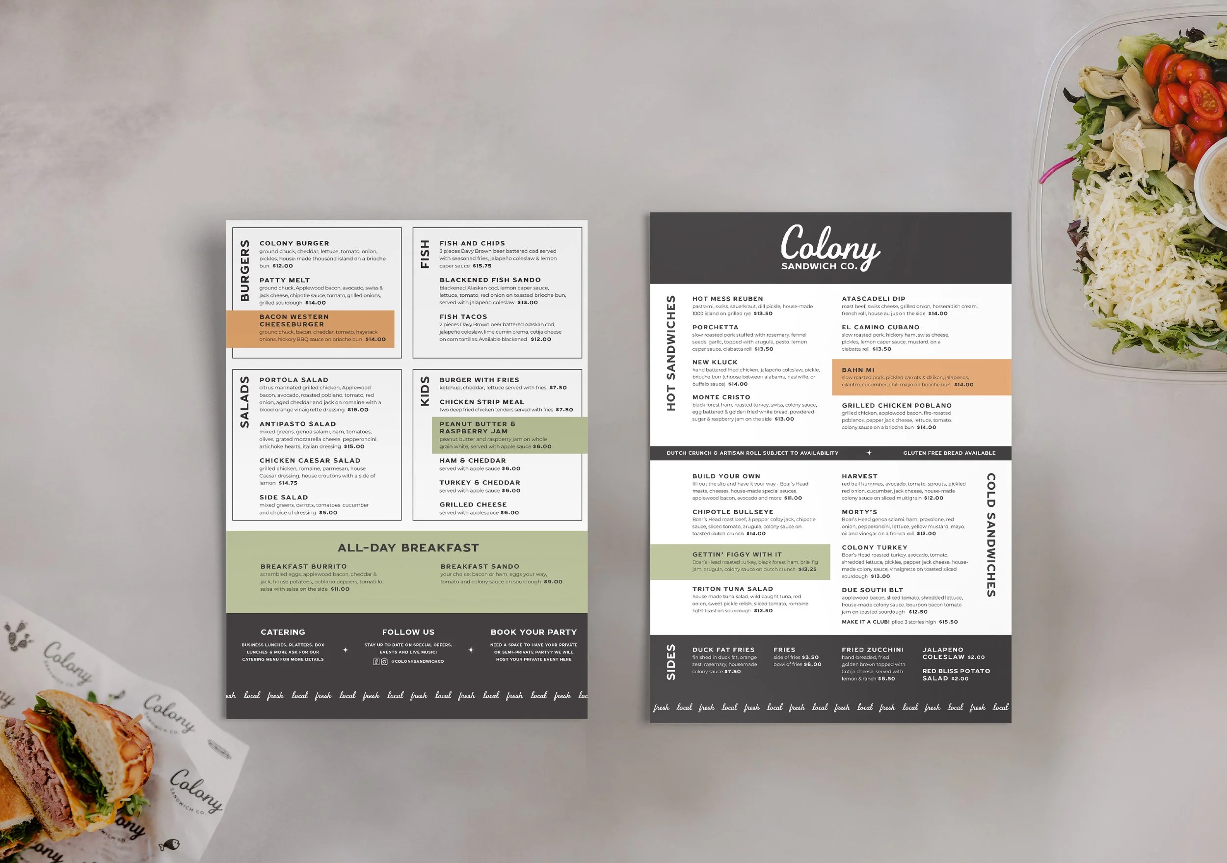
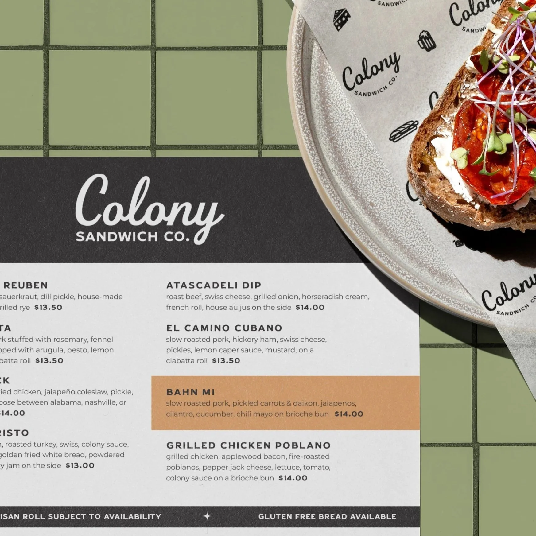
Menus, signage, and printed materials extend the identity seamlessly—inviting touch through textured papers and refined finishes. Bold layouts highlight shareable plates; gold accents elevate merch and glassware. The system maintains cohesion from digital to physical.
PROJECT SCOPE
BRAND IDENTITY
SIGNAGE & ENVIRONMENTAL
SECTOR
FOOD & DRINK
COLLABORATORS
SARAH KATHLEEN, PHOTOGRAPHY
NEXT PROJECT